Something that burns inside of me is getting justice for minorities and for women. While there are many different issues to discuss between the two topics, I thought that by choosing the subject: “businesses adopting a ‘Pay Transparency’ policy,” it would be a beautiful blend between one of the many different plights of minorities and women alike.
Pay transparency is simply making all employee’s salaries public.
From the CEO, to the hourly worker- everyone knows. By doing so, it automatically enforces equality in pay scale among all workers and helps to get rid of favoritism and bias. One day I hope that we will get to see the topic on our ballots and vote for equality! This mock campaign is seeking to uncover uncomfortable truths in pay discrepancies as well as trying to bring awareness to the vote.
Step 03
Create Mockups
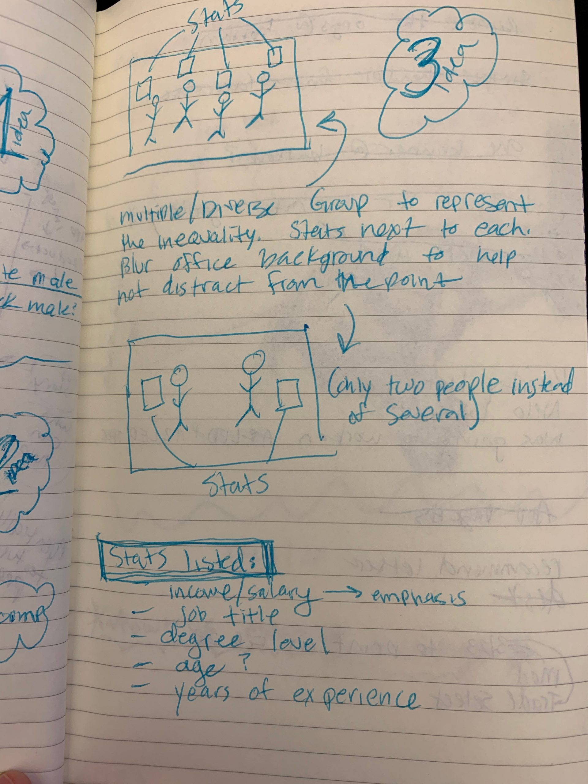
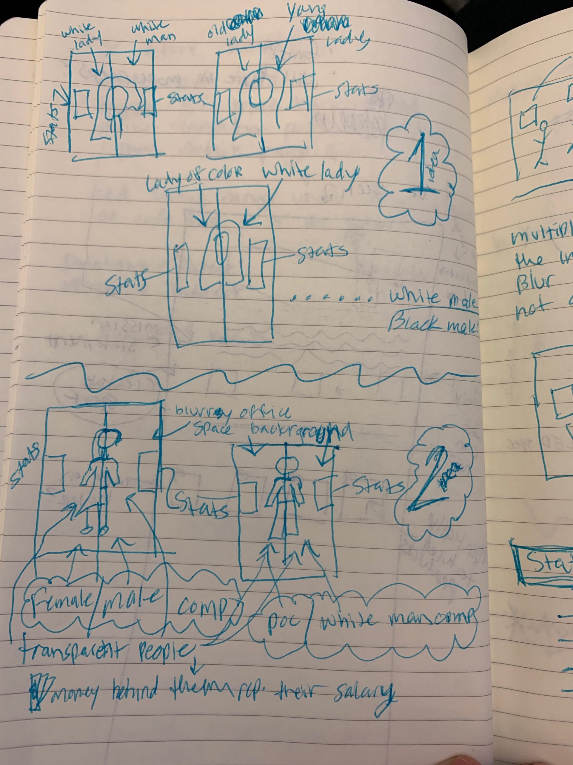
I sent my notes and sketches to some of my co-workers, who are designers as well, asking for feedback. Through conversation and discussion, they shared with me their thoughts and told me which ideas and layouts they thought were the strongest and why.
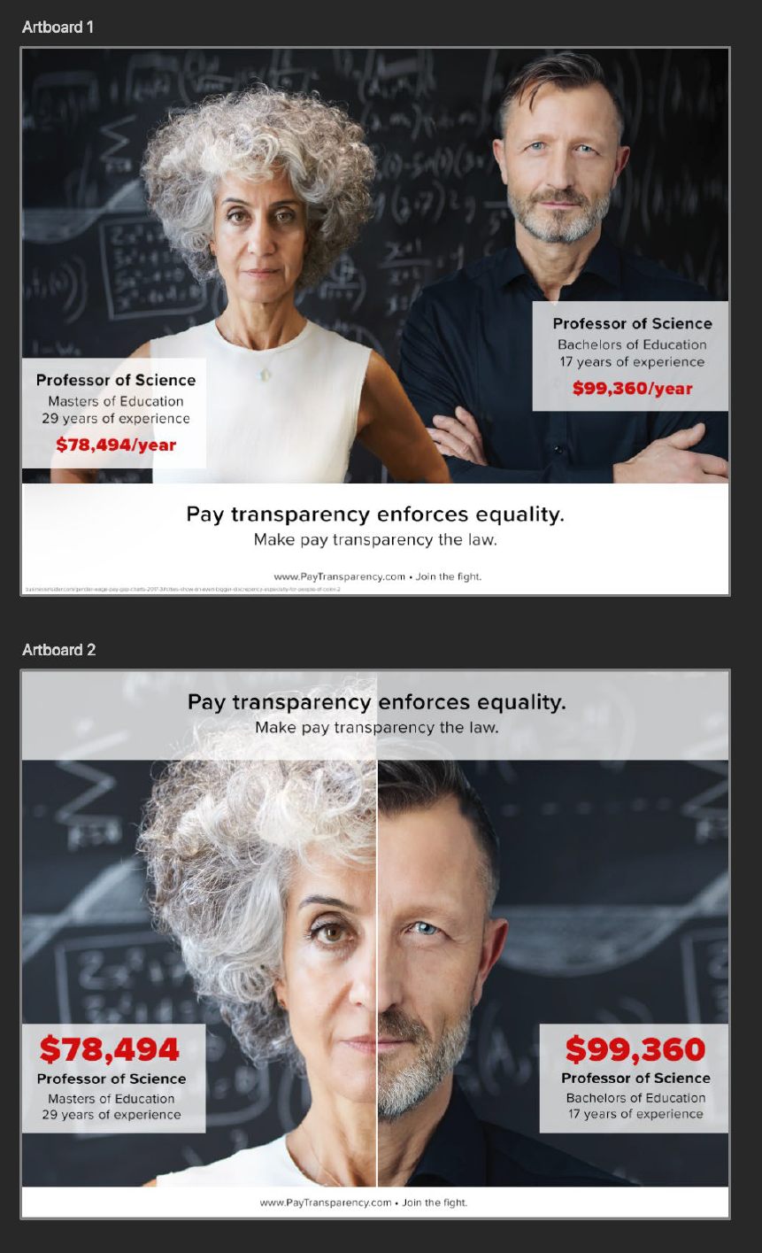
Next, I started asking other people for their thoughts and opinions who were not designers and who did not know my topic. I made some mock-ups (left) to show them and asked which made more sense (if any) and which had more impact to them. The vote leaned ever so slightly to the image displayed on “Artboard 1.” It was a tough call for me, because I was more visually drawn to what was on “Artboard 2” and wanted to go with that design. Even though I was torn, at the end of the day, it’s more important for me to be as clear as possible on my messaging – as opposed to a “cooler” design that is potentially less straight forward.
Step 04
Create The Campaign
With the over all design decided, I needed to decide the strategy for the campaign. Where would these ads go? Online? Of course. I made three different ads for the same campaign and sized them according to the guidelines of Google’s display ads.
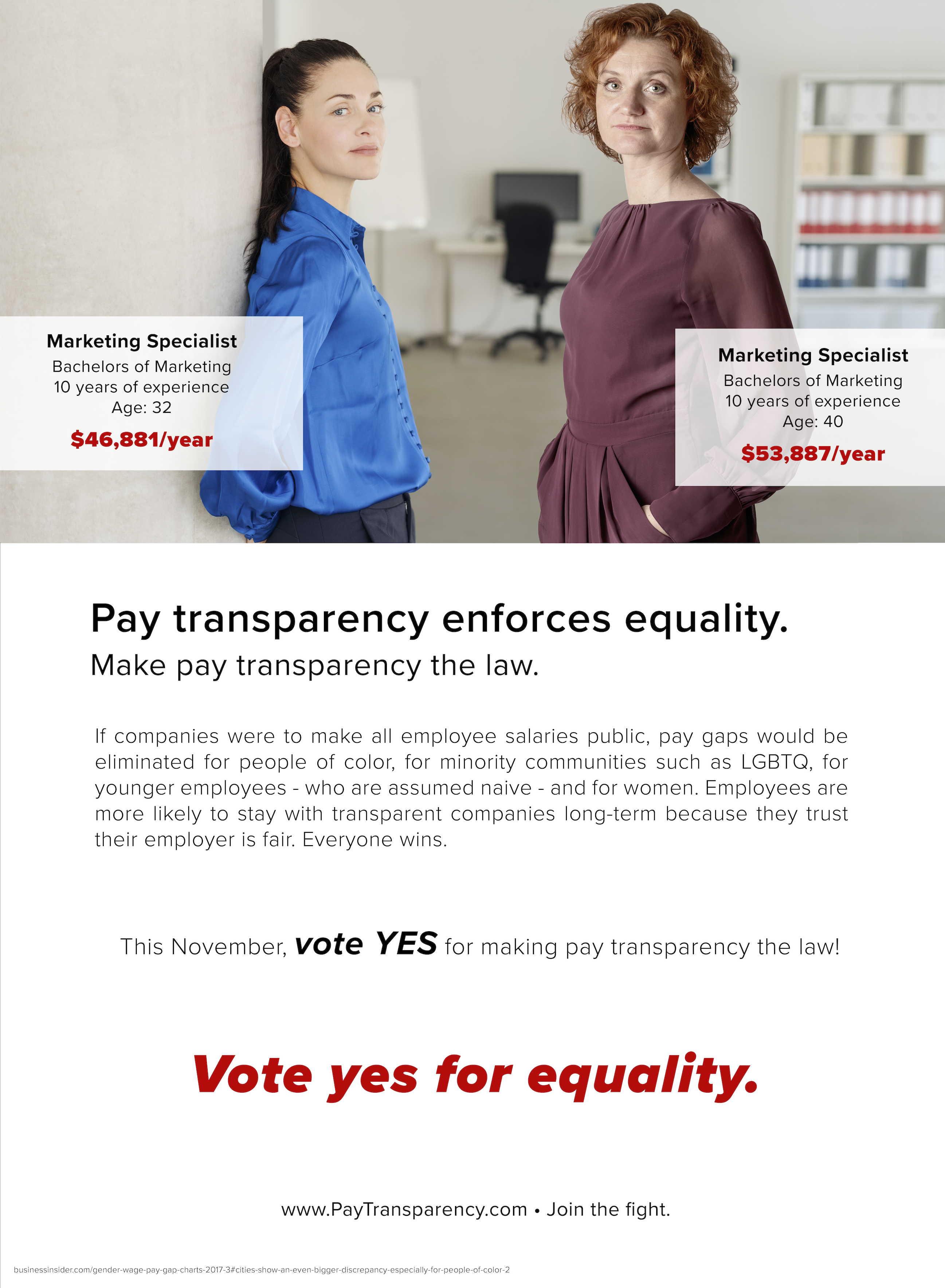
Posters for public transportation
Where else? Big city’s public transportation. Millions of people use the subway, buses, taxi cabs and covered benches. I decided to make some posters with a bit of copy that elaborated on the issue. These posters could go in the subway stations, in the trains themselves and on signs next to the covered benches provided by public transport.
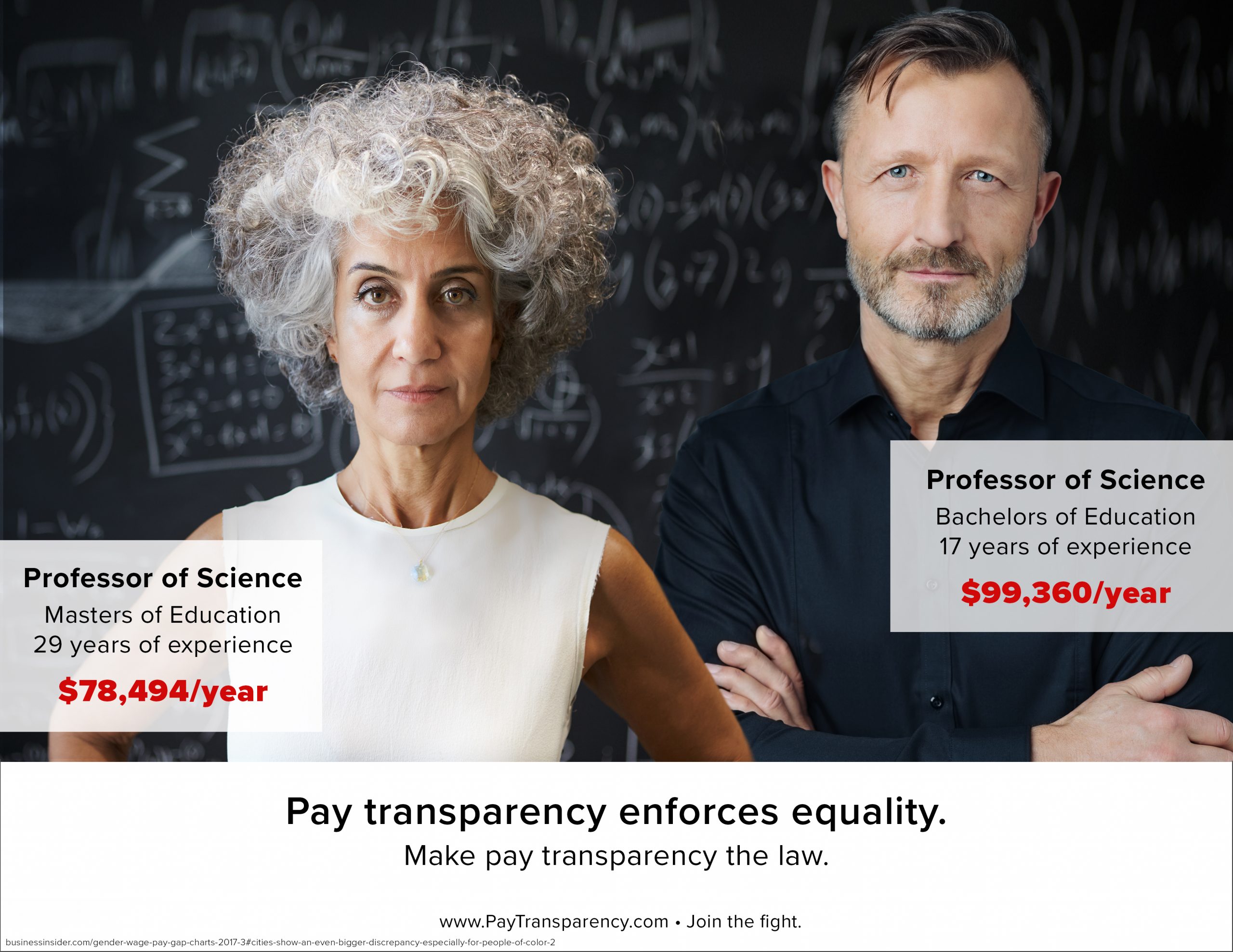
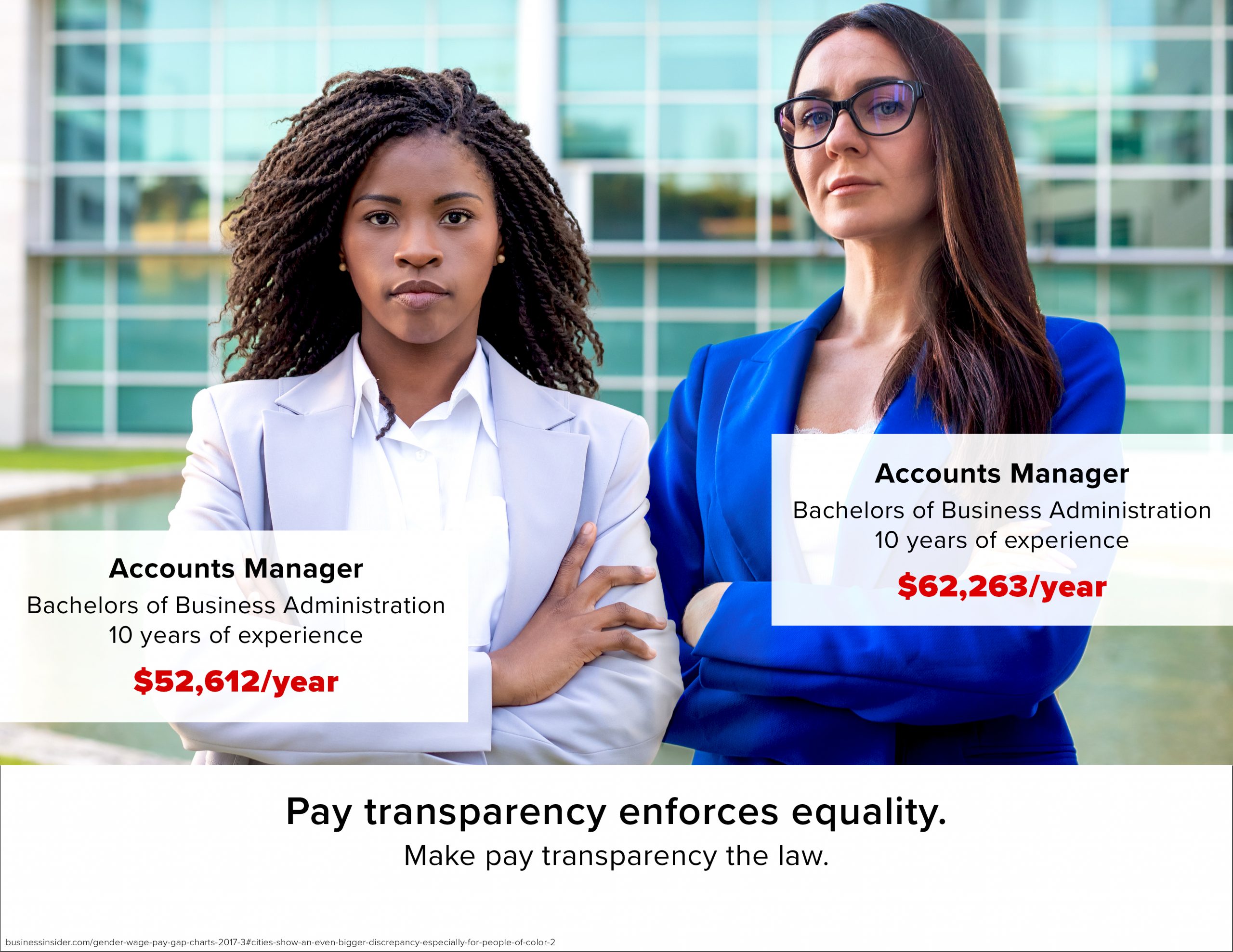
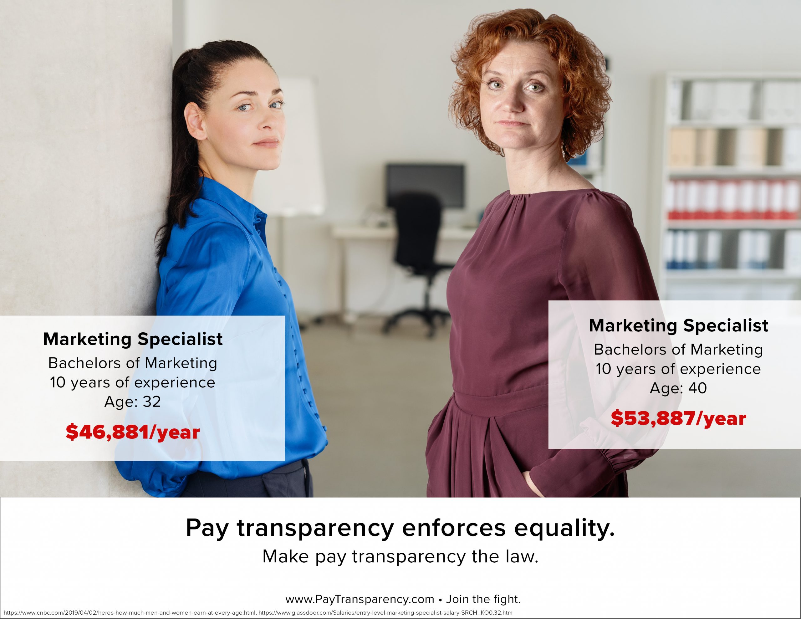
Below are the proposed “posters” for the campaign. (The website, “www.paytransparency.com” is not real, but an element that would be used in the campaign.) The main website that was used to research into the pay gaps is sourced at the bottom of each poster.
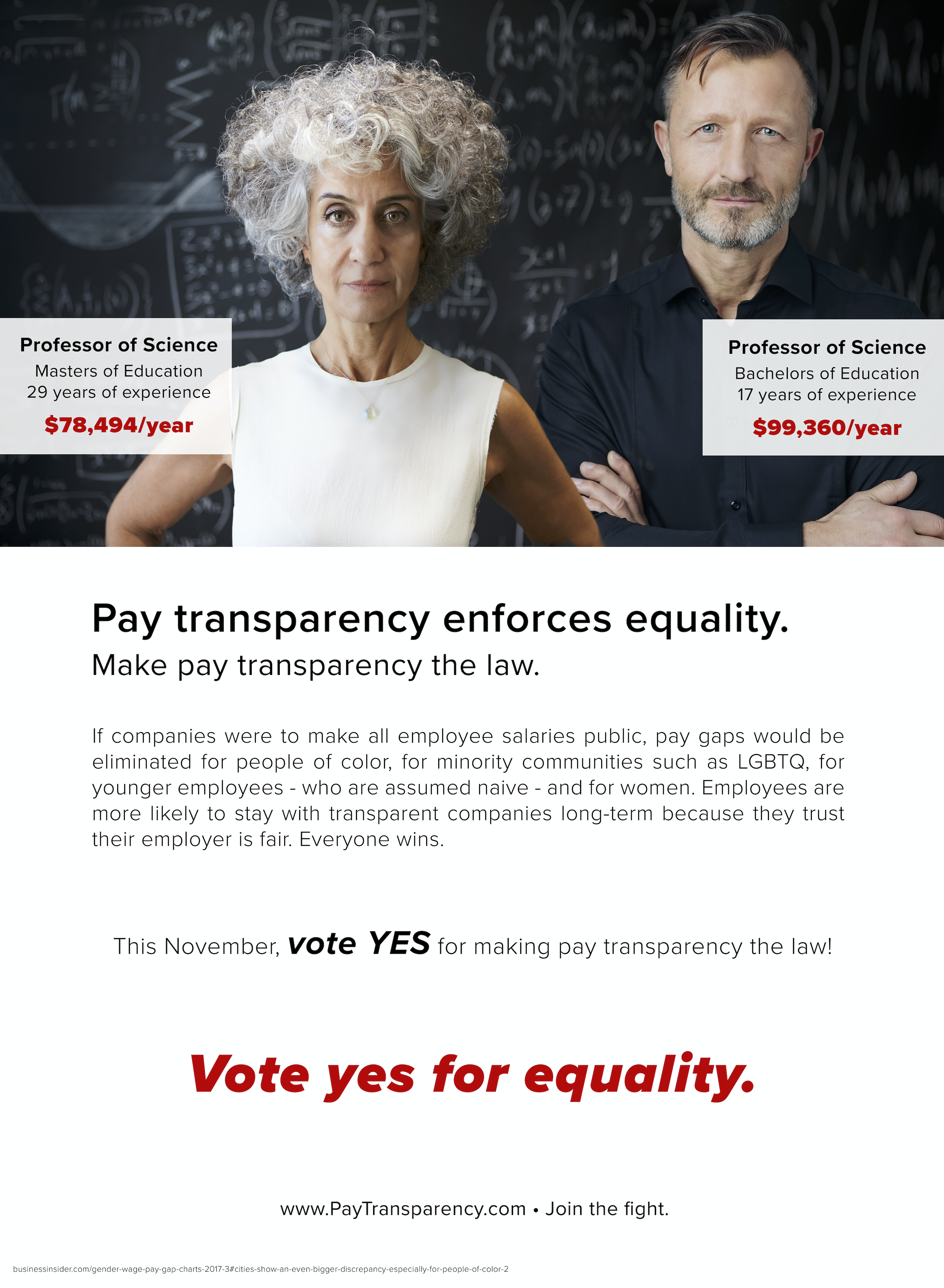
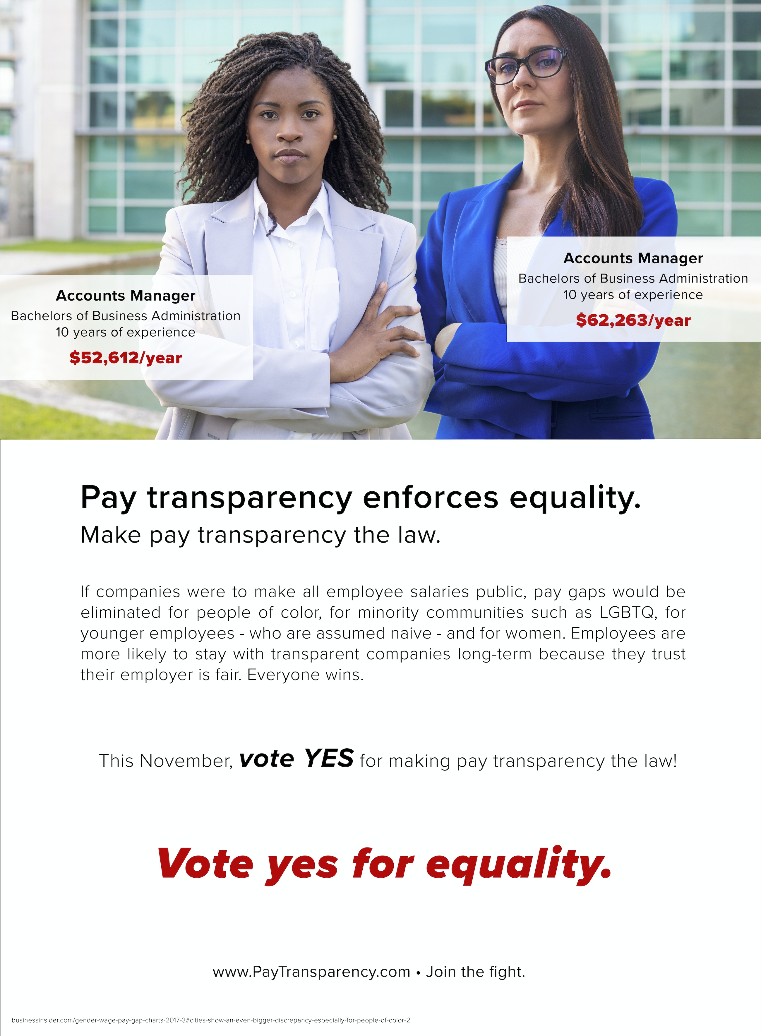
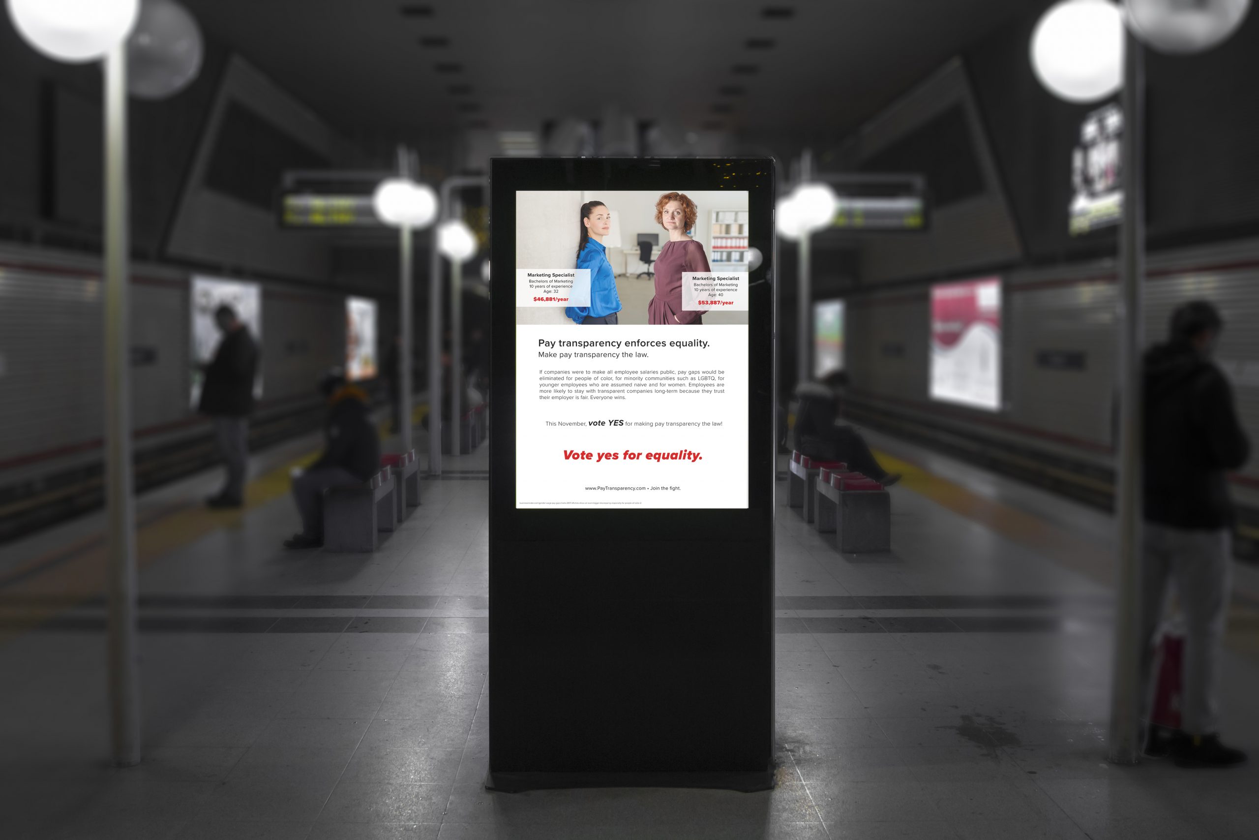
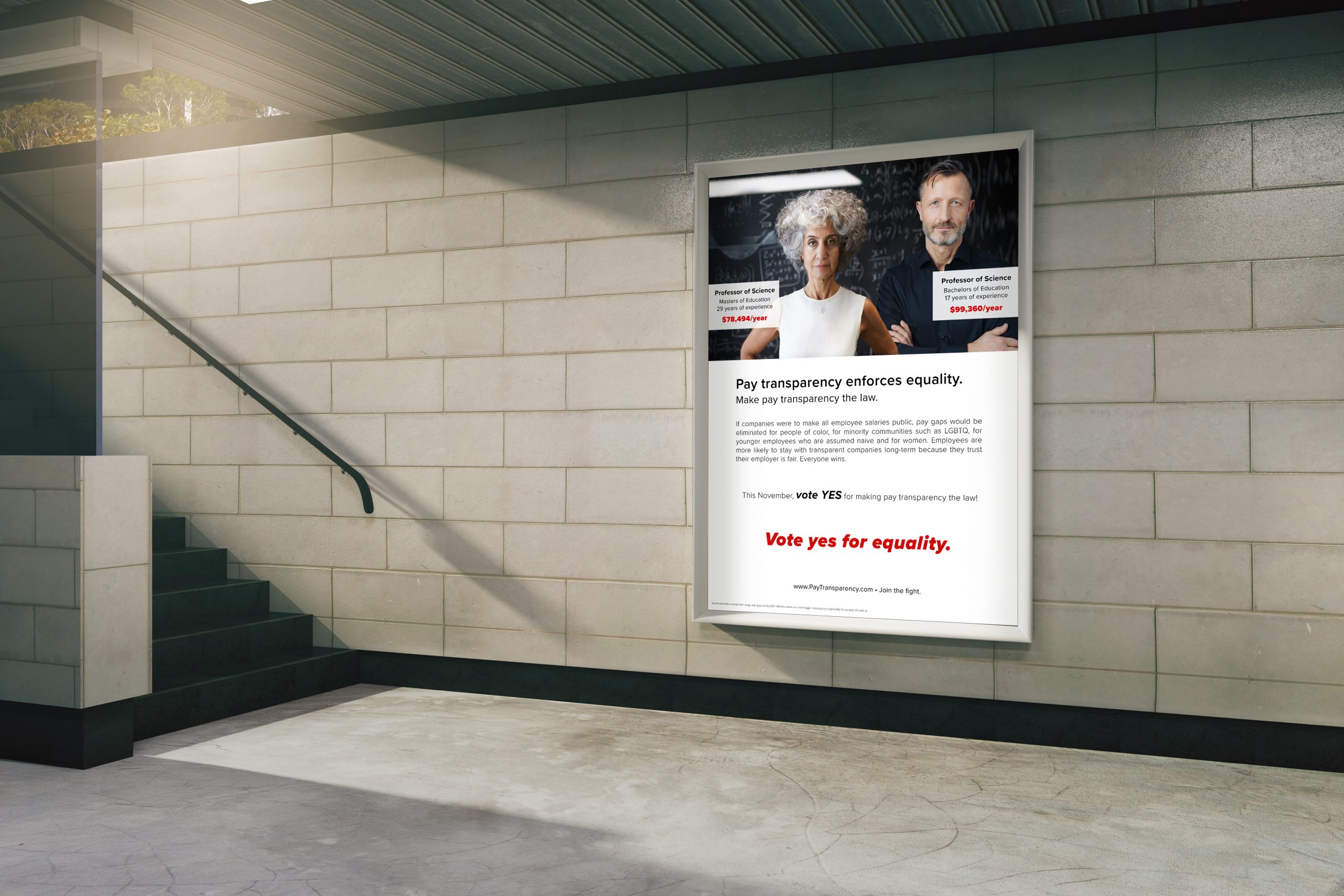
Subway Examples
Two mock applications of the posters in a subway station are below. Please click on the images for a larger view.
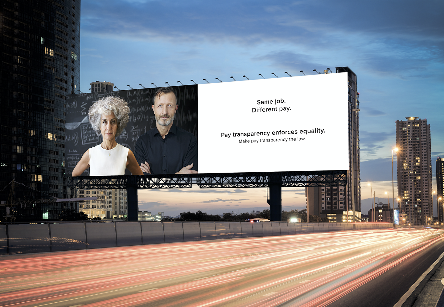
Billboard Examples
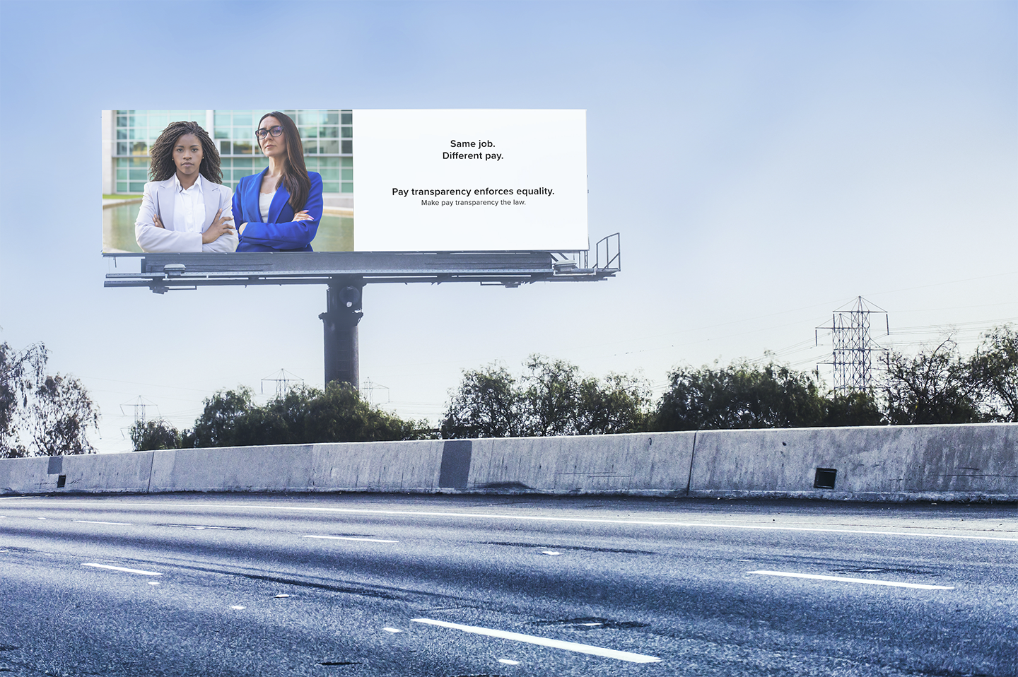
Lastly, I thought billboards along major highways and interstates could reach many people all over the nation.
Research shows that marketers only have 5 seconds to get their point across to drivers. Therefore, the billboards are even more concise in their attempt to tell the story in four words; “Same job. Different pay.” There are not three billboards here – like the other applications. This is because the “age difference” idea is visually less easy to digest in only 5 seconds. For the sake of clarity, that image is not included.
It all may only be a dream campaign…
But who knows? Maybe one day we will all see pay transparency on our ballots!