Kurt Versen
Goal
Rebrand the company
Deliverables
- Collateral redesign and creation
- Brochure redesign
- Website redesign
- Social media graphics
- Strategy
Roles and responsibilities
Concepting: Becky Ware, Alex Villeverde, Melissa Reim, Cory Passerelo, Alyssa Reynolds
Creation and execution: Becky Ware
Copy and approval: Katie Walling, Melissa Reim
Every great design begins with an even better story.
Kurt Versen (KV) is a lighting brand that had fallen on hard times. This was the second brand at Hubbell Lighting that I was able to help rebrand. KV was outdated, and products redundant. Basically, it was boring. I came into the project early on and was tasked with breathing life and personality back into the brand. There were almost no limits, so we wanted to push some boundaries and come up with a persona that was out of the box to grab some attention! (Some items had already been decided such as the logo and colors.)
The challenge was trying to elevate the brand, update it to be more interesting and make it more trendy and relevant!
The brands immediate needs were threefold.
01
Kurt Verson needed a killer persona. We are talking personality! This was not going to be a boring brand.
02
The website needed to be completely redone before launch.
03
A brochure needed to be created to explain the new brand and create brand awareness for upcoming tradeshows.
Logo & Colors
Kurt Versen had already established colors and a logo before I came onto the project.

Pretty in Pink
#af3761
Ice Blue
#bce1e2
Ocean Blue
#55d892
Grasshopper Green
#ced933
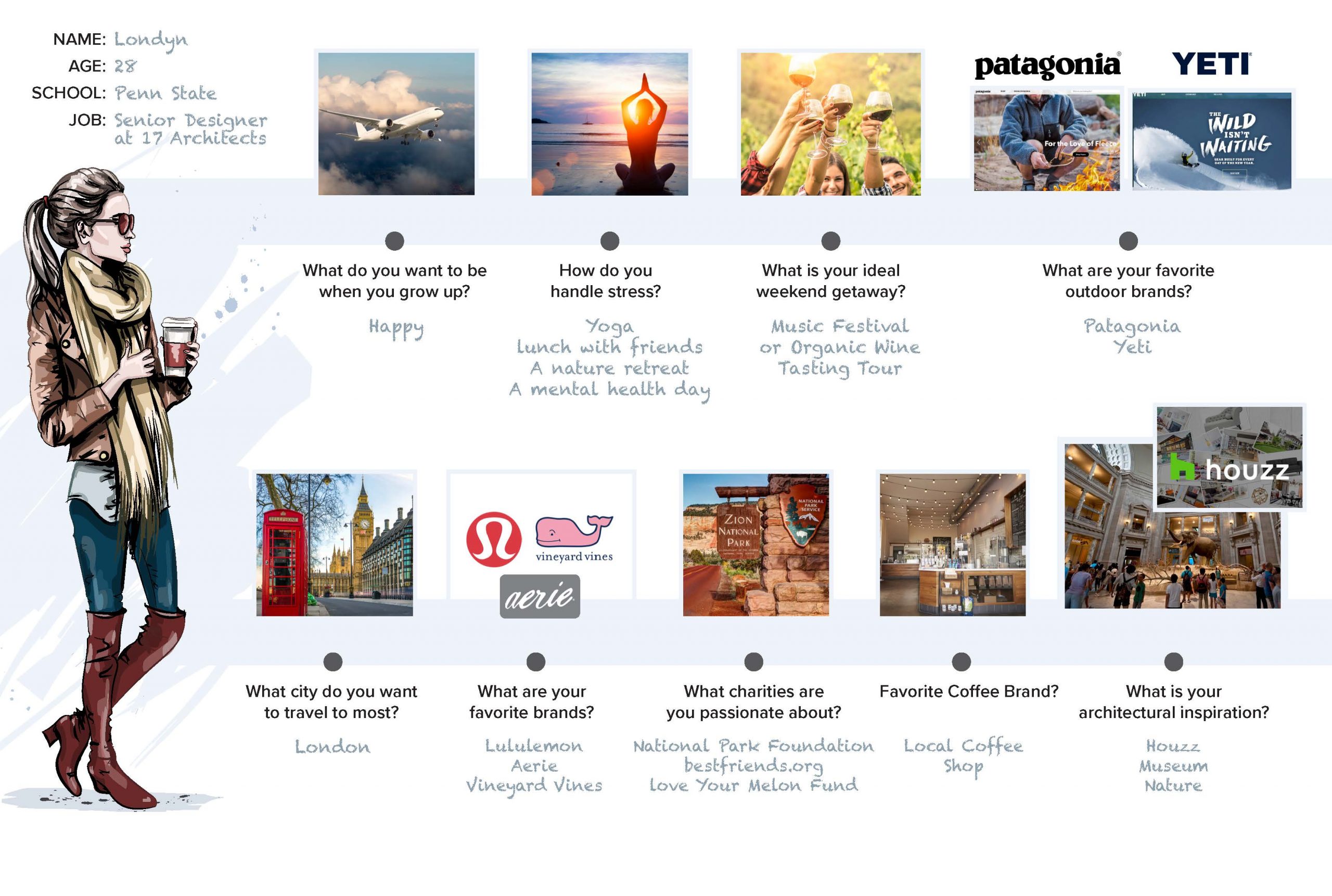
Persona Board
Website Redesign
Landing Page
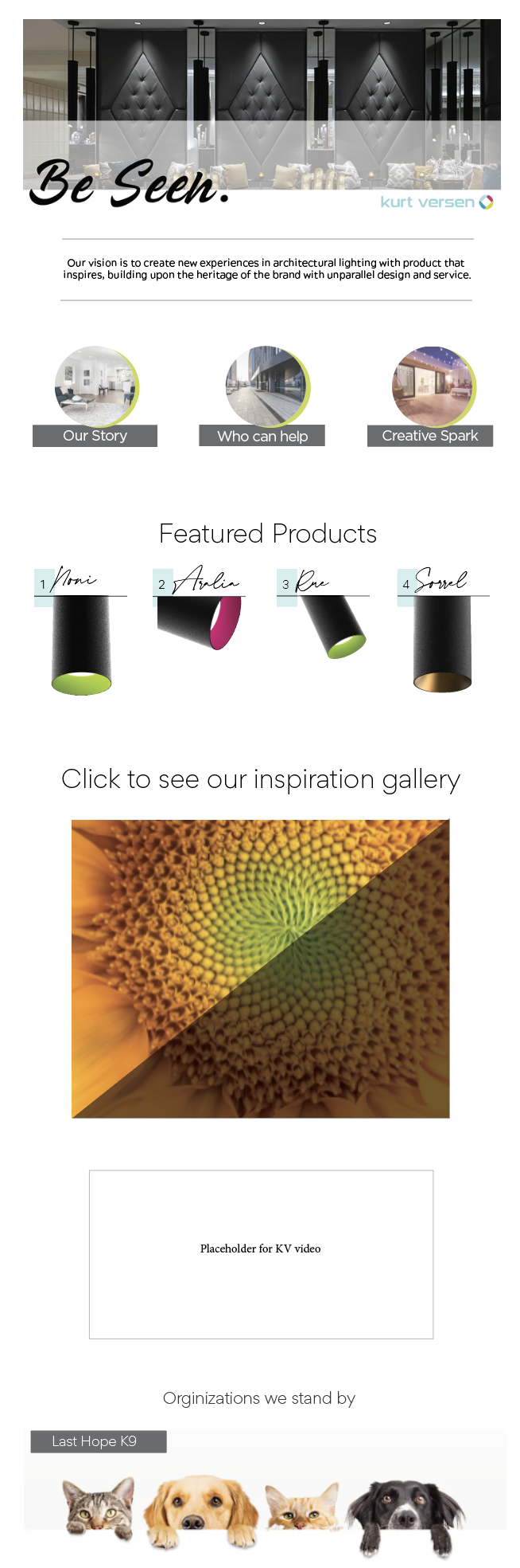
The header here is a sliding banner meant to be added to and switched out as new products and news arrives.
Here is some site navigation that will take you to three different pages, the first is the story of KV, the second is employee contact information and the third is an instagram-like feed that shows the brand’s inspirations.
This section is where the most recently launched products would be highlighted.
Here is another call out to the brand’s instagram-like feed that shows the brand’s inspirations.
The KV brand video would go here once completed.
This section is meant to highlight that the brand cares about important issues such as the welfare of animals. Clicking on the image would take you to another page describing the shelter and a way to contact them.
About Us
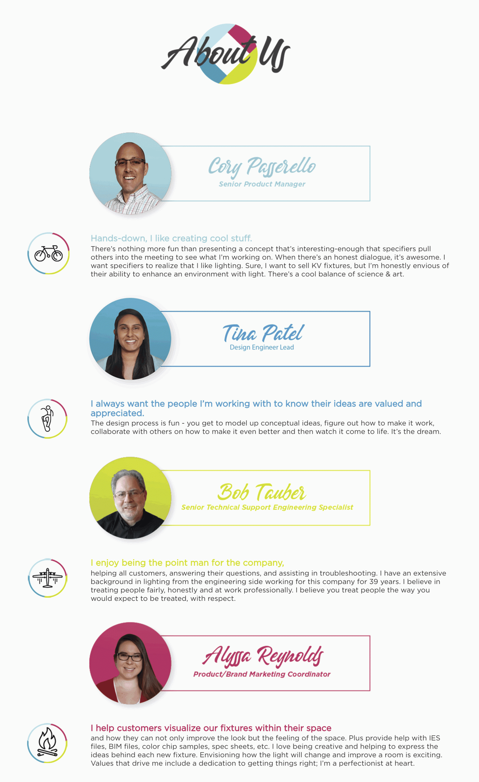
Here you see some picture bubbles laid on top of brand colors with a small info section below.
All of the icons to the left are animated gif’s. They are pretty fun.
Look Book