ChartSpan Medical Technologies
Goal
Rebrand the company
Deliverables
- Collateral redesign and creation
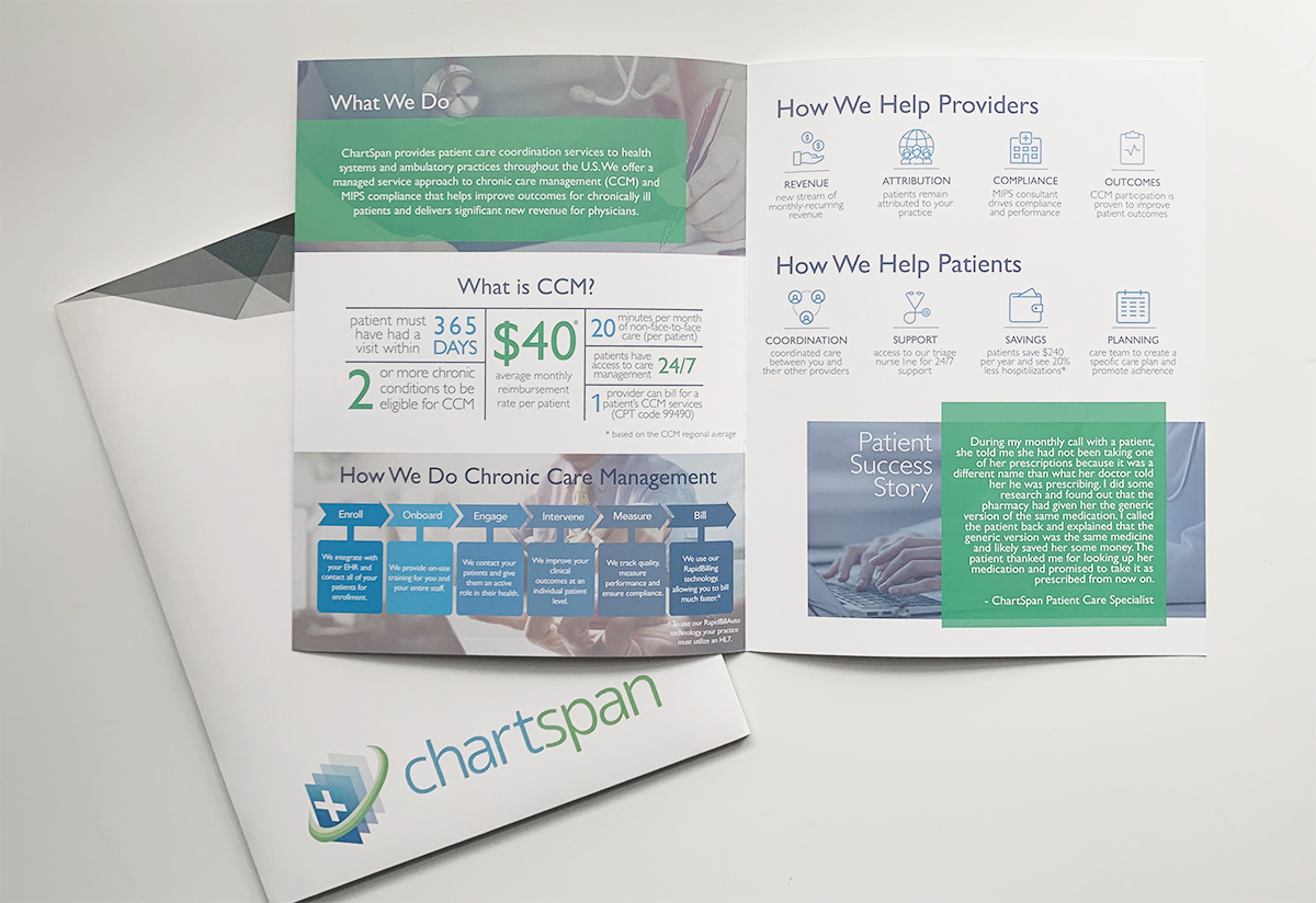
- Brochure redesign
- Website redesign
- Digital advertisements
- Social media graphics
- Photography
- Strategy
Roles and responsibilities
Concepting, creation and execution:
Becky Ware
Copy and approval: Katie Walling
Somewhere, something incredible is waiting to be known.
I was hired at Chartspan to help re-brand the company, make collateral, and coordinate and create digital and social media ad campaigns.
The challenge was trying to explain or show what ChartSpan does in a simple way, only- it’s not a simple subject!
Chartspan is a third party company that provides preventative healthcare services for chronically ill patients by supplying them with an app, monthly check-in phone calls and triage phone calls. In turn, helping the doctors earn extra revenue from the government by providing this service to their patients. The only catch is that the rules which must be followed under HIPAA, Macra and MIPS are incredibly strict and deeply complicated. If the providers do not follow the rules precisely, huge fines and even jail time could be the result. Most doctors don’t have time for this, so Chartspan steps in by both providing the preventative services and making sure the doctors are 100% compliant.
Despite the heavy nature of the business, the company wanted to present a youthful, funny and lighthearted persona to the general public – as was “on trend.” Most of the patients were elderly, however, their adult children as well as the doctors are more likely inclined to respond online which made a younger online persona appropriate.
Chartspan’s needs were three fold.
01
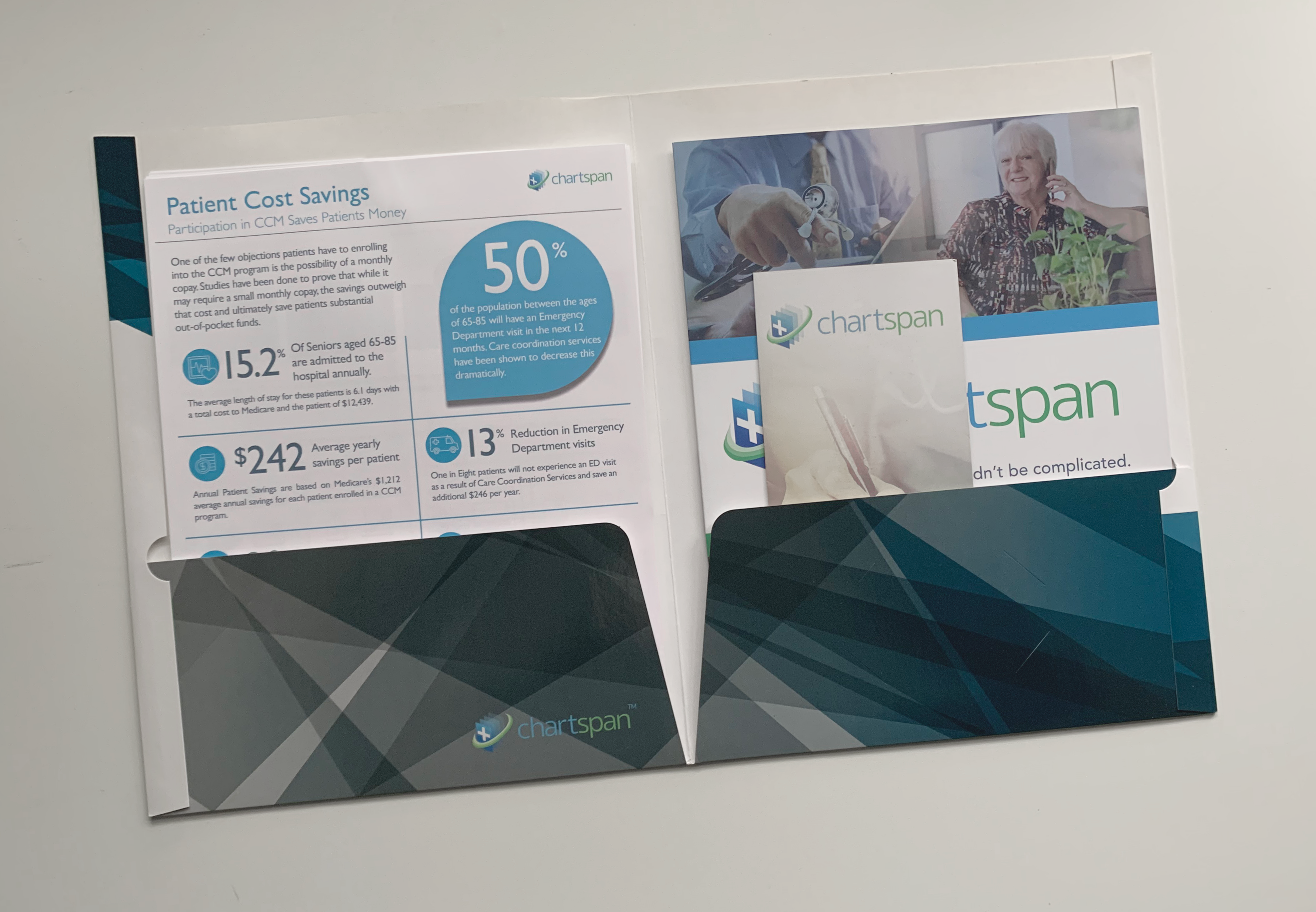
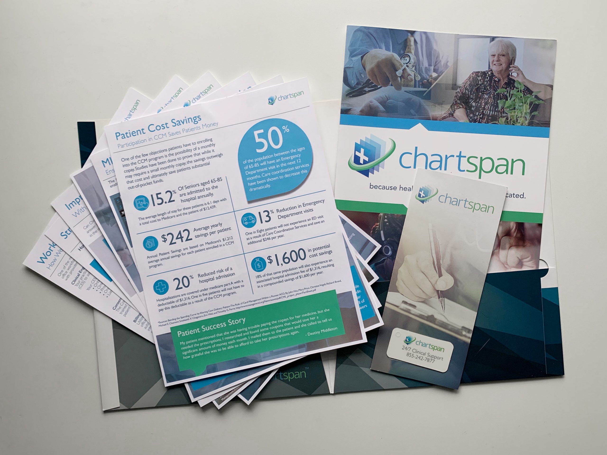
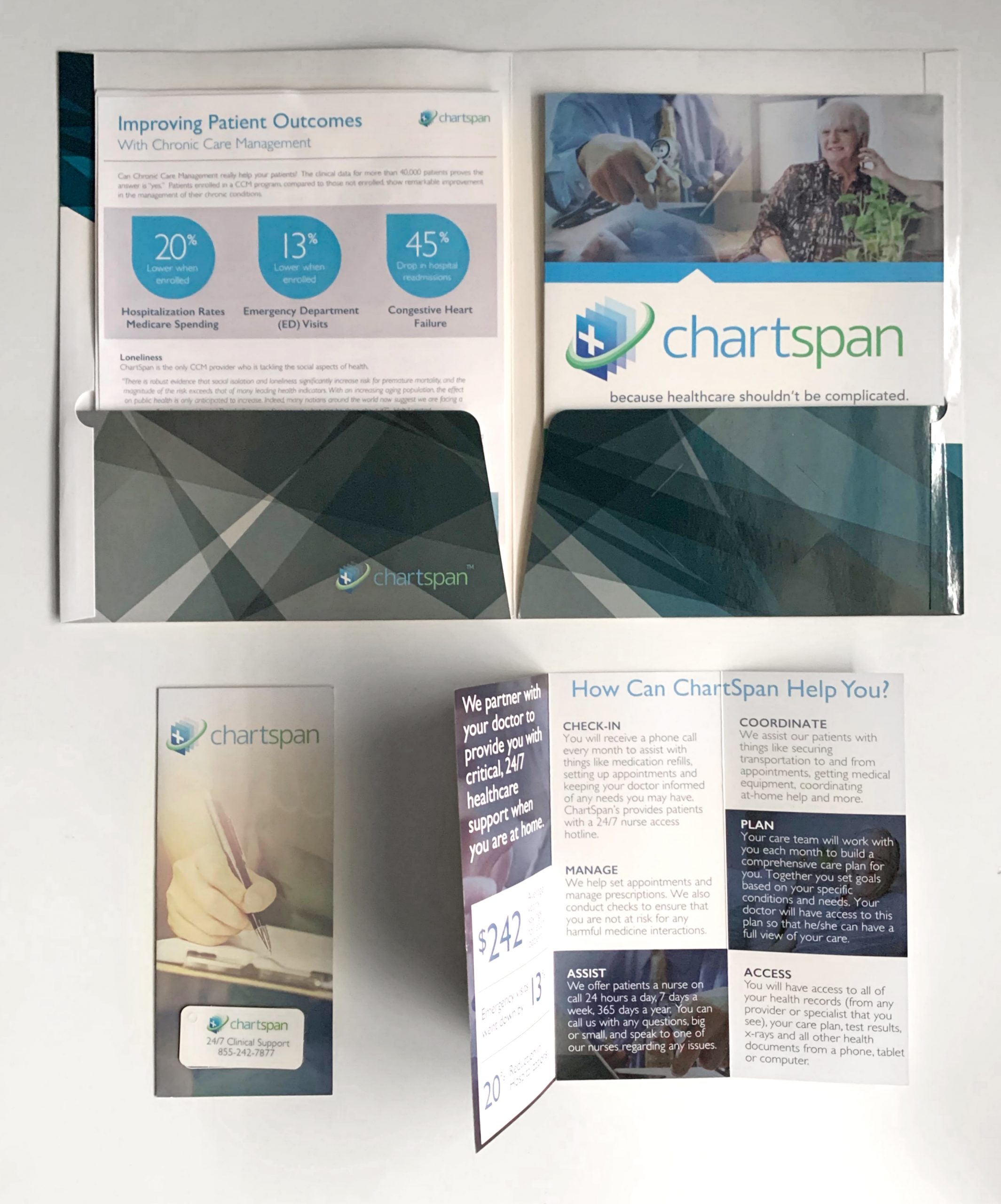
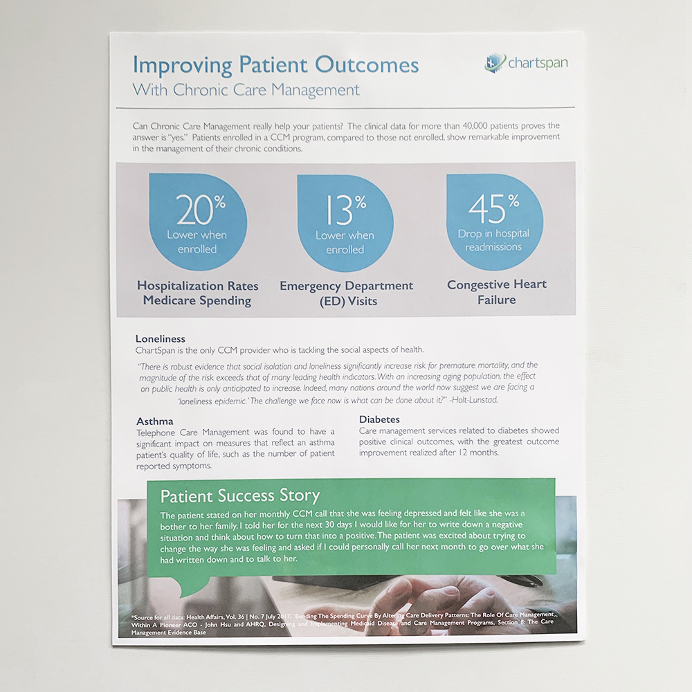
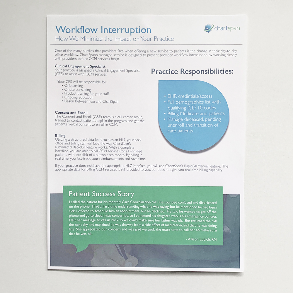
Chartspan’s sales agents needed in-depth and complicated material turned into multiple one-page hand outs.
02
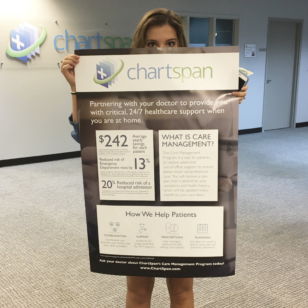
Doctors partnering with ChartSpan needed informational posters, brochures and flyers to explain who ChartSpan was to their patients.
03
Brand awareness to the practices, patients and potential patients was also needed.
Logo & Colors
ChartSpan wanted to stick with the colors and logo that they already had for brand awareness. Their request was honored.

Sky Blue
#5eaee1
Washed Blue
#2f3530
Soft Green
#55d892
Collateral Delivered
After weeks of studying the laws surrounding chronic care management and understanding what the company did, my team and I were able to produce the following:


Project Stats
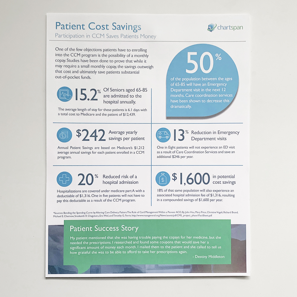
20
decrease in patient hospitalization spending
13
decrease in patient emergency department visits
45
decrease in patient rehospitalization
Website Redesign
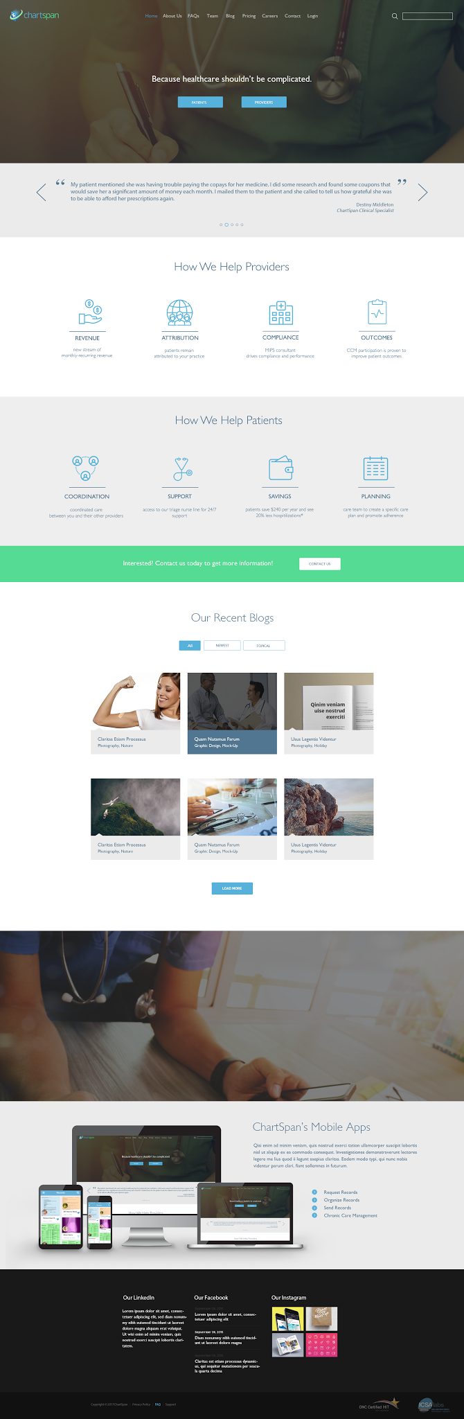
Sadly, the website was never built, but if it had been, the header would be a sliding banner. It has buttons to help direct whomever may be visiting the site; patients or providers. Below it is a looping testimonial slider from ChartSpan employees, patients, and doctors.
Benefits to doctors and patients both are called out in this section.
Call to action: “Contact Us” button
This section houses ChartSpan’s recent blogs to help improve SEO and to possition themselves as industry experts.
At the bottom is an advertisement for ChartSpan’s phone apps, and online user portals.
Lastly, ChartSpan’s social media links and posts are placed for the viewer to see and follow.
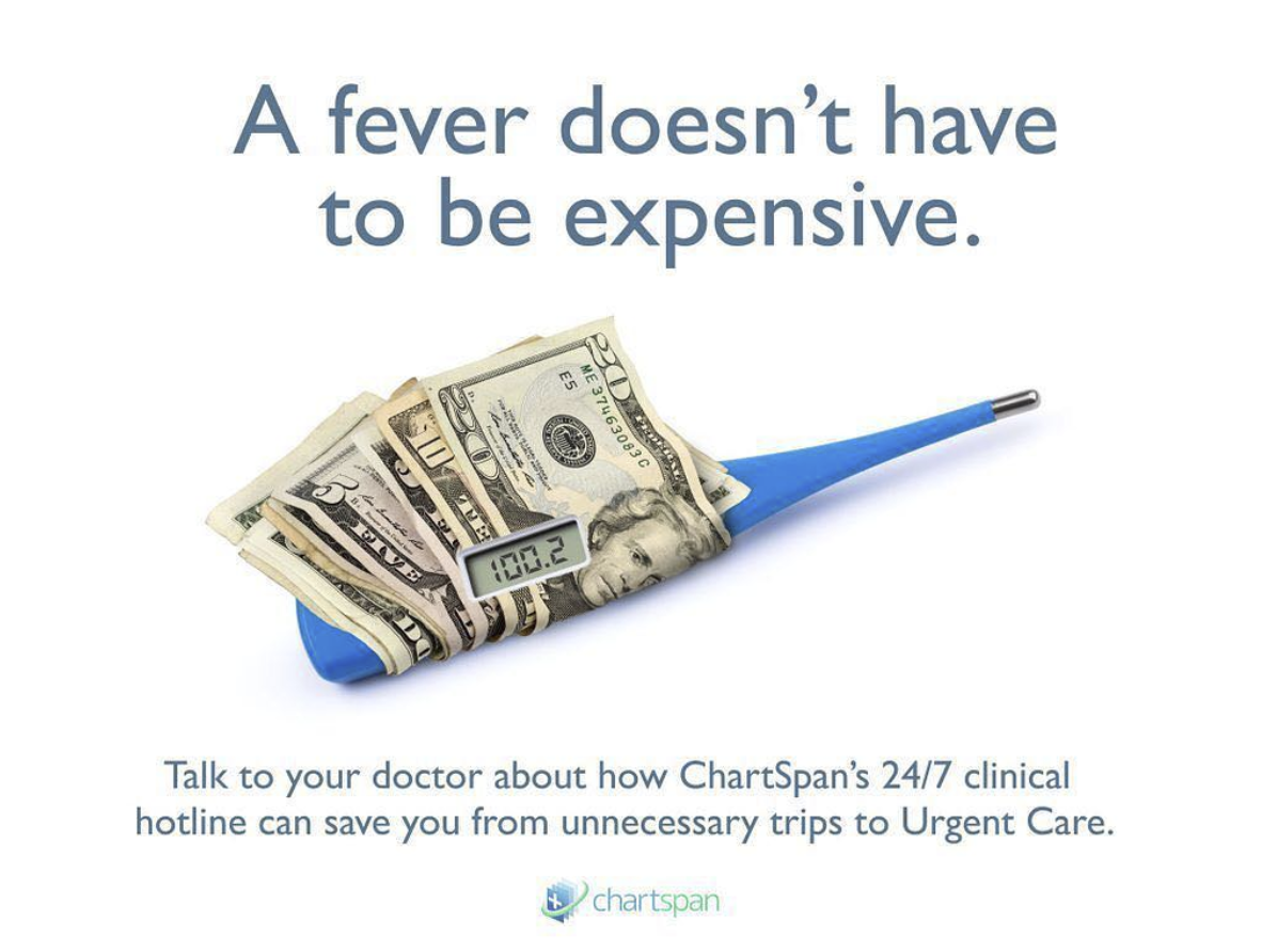
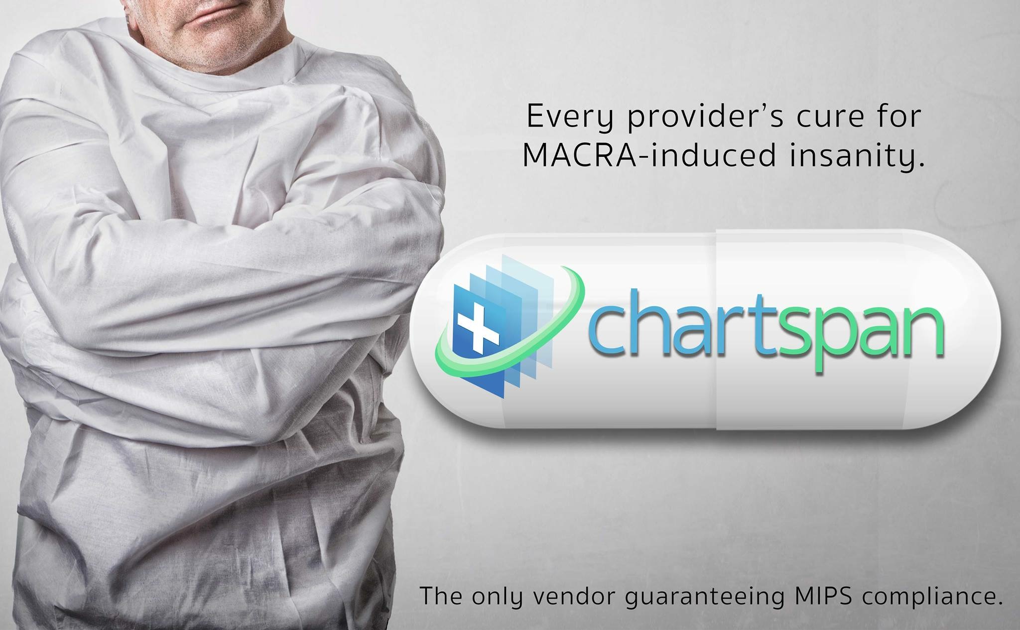
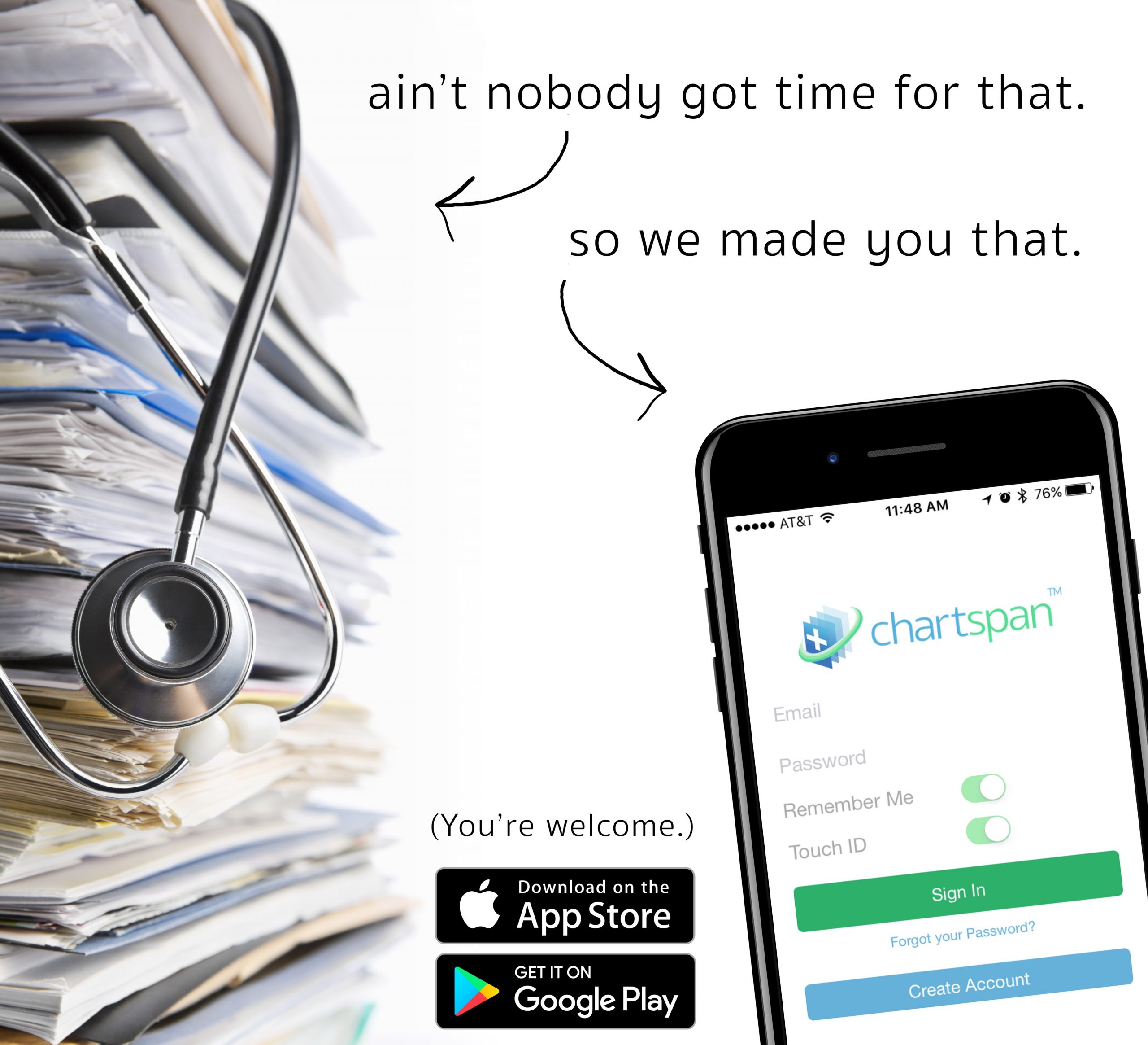
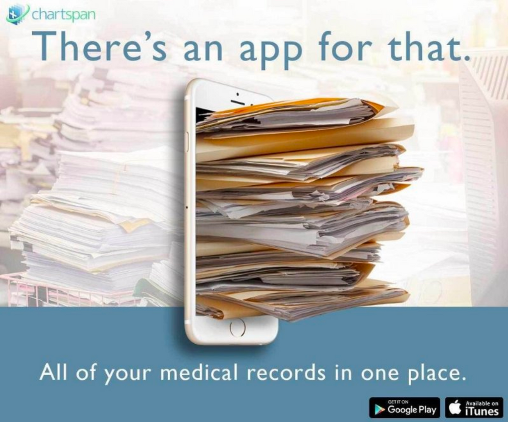
Digital Ads
Staying true to Chartspan’s desire to be clever and youthful, I concepted and created the following ads. The first ad is meant to be geared towards patients who can potentially save money by first having a triage call with one of ChartSpan’s nurses instead of going to the ER. The next ad was directed towards doctors and practice managers and placed on LinkedIn and targeted digital Google ads. The last two were patient-facing and emphasizing the ease of keeping all of your medical records in one place.