Benefitfirst
Goal
Rebrand the company and remake the website.
Deliverables
- Branding guidelines
- Website redesign
Roles and responsibilities
Ideation, creation and execution:
Becky Ware
Copy and approval:
The CEO, CTO, Benefit First team and Business Development
“You can’t wait for inspiration, you have to go after it.” —Jack London
Benefit first is a private, cloud-based, SaaS company who sells a benefits eligibility management product that automates and supports an employer’s complete benefits cycle for both the employee and the HR team.
I was hired at Benefitfirst to be the lead UI/UX designer and was tasked with recreating their website to bring it into the 21st century (their words, not mine!) keeping Web Content Accessibility Guidelines (WCAG) 2.0 and 508 standards in mind. I was to start with the public facing pages. I was also tasked with creating and maintaining all aspects of a brand style guide (logo, color pallet, typography, imagery, brand story, voice).
Branding
I started with branding. Benefit first already had established their logo and a basic blue that they used. However, the blue was not given a hex code and it varied throughout the site. I went ahead and identified the hex code and expanded upon the basic color pallet.
Primary blue
#245CAB
Primary Variant
#00337A
Body Copy
#666666
Secondary blue
#249FAA
Secondary Variant
#2f3530
Accent Gray
#55d892
Branding Guidelines
Below you will see a video of a website that I made with Adobe XD which contains most of the design system and web branding information that I created.
The great thing about this site is that any developer can go to it, click on an element and instantly get information like font name, height, color, a little CSS and HTML and more. See for yourself! At the end of the video you will see that I also have a more basic web branding guidelines. This is so that the developers can start standardizing the internal site. Currently, it’s all over the place. This will be my next big project.
Mockups
First, I start with pen and paper! I do many sketches to determine layout, general content placement and play around with ideas! Next I move onto prototypes in Adobe XD. I challenged myself with this: make one mock up that is as close to their ideas as possible. Make a second mock up that is a bit different from from their vision. Make a third mock up that they would never expect, blow their minds, and hope they choose that one! Eventually, I ended up with three mock ups you see below.
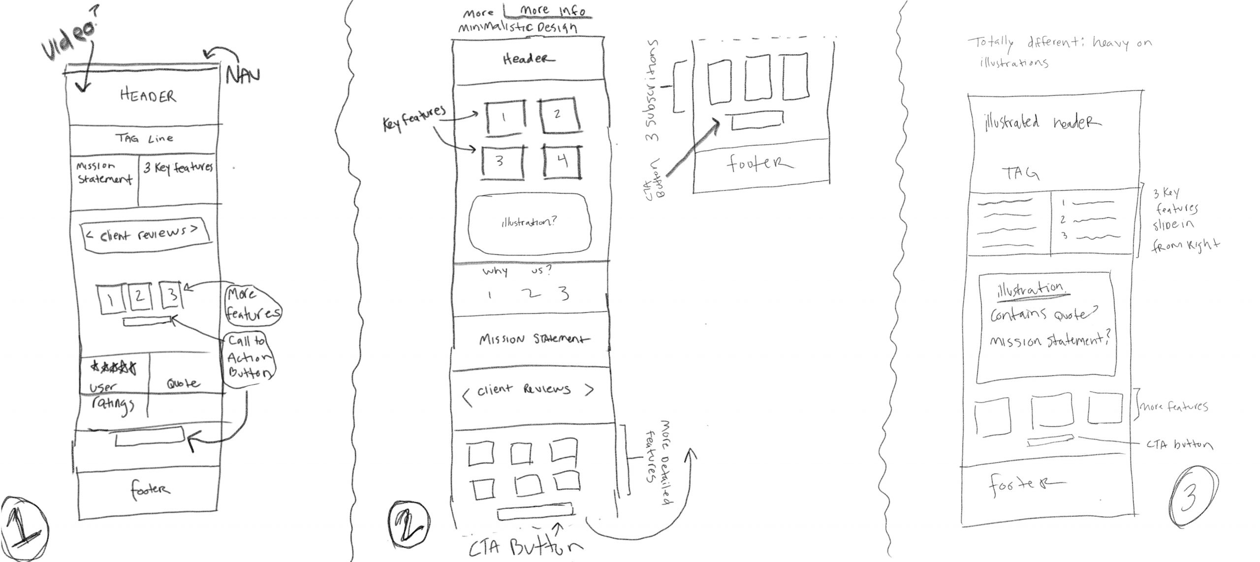
01
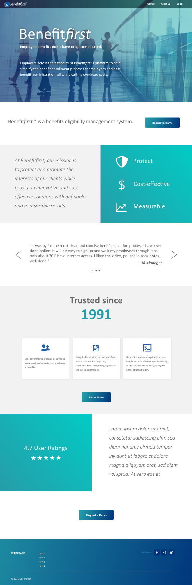
The CEO is a big fan of video. So, the first mock up I did had video for a header (sadly, not seen in the static image below) and filled in the rest of the page with company content and animations. The words in the blue boxes actually fly in from the edge they are closest to as you scroll down.
02
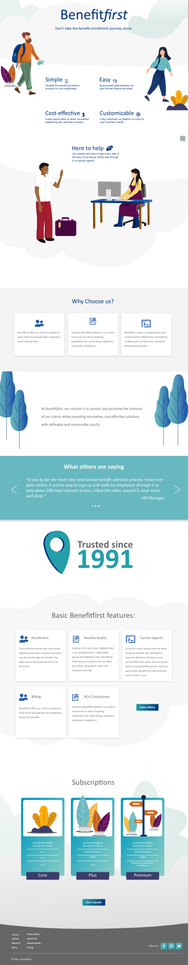
Illustrating websites is a big deal right now. Since the company was trying to update their aesthetic and appeal to a younger crowd, I thought this would be a great choice. The company had mentioned having a light and white background at one point, so I incorporated both!
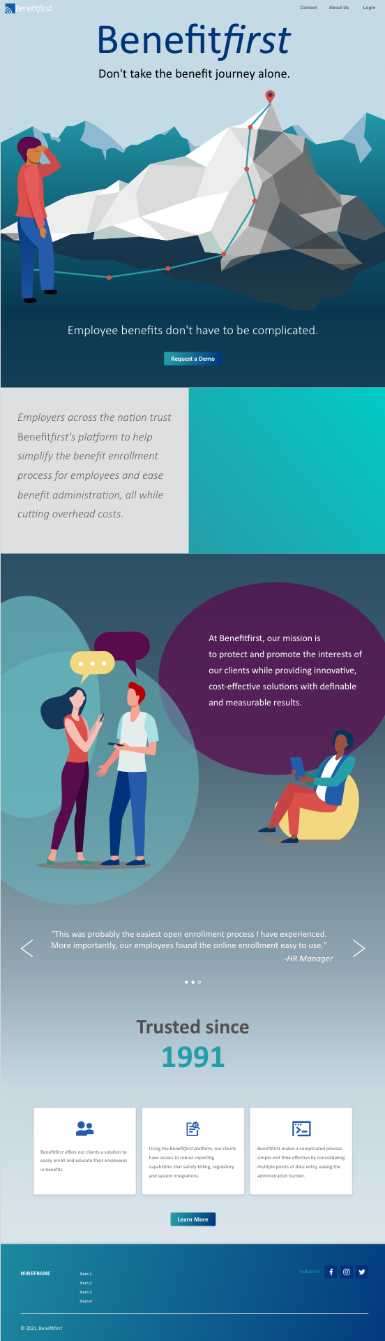
03
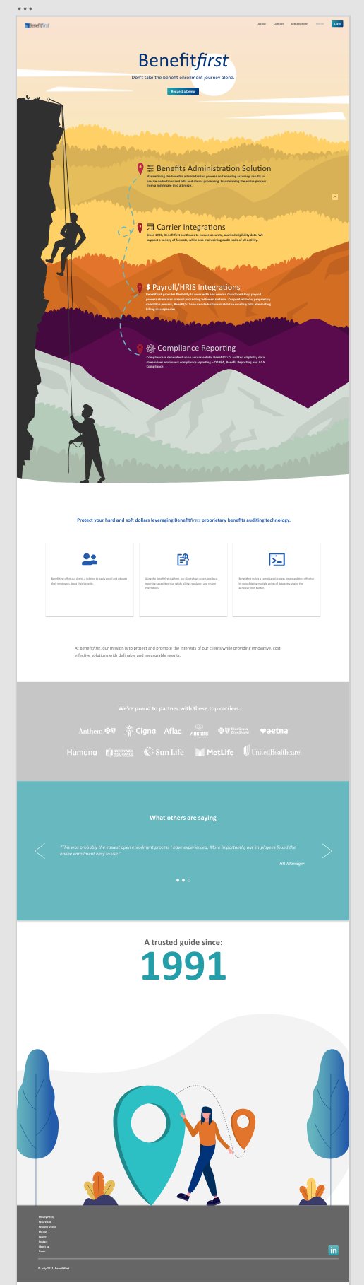
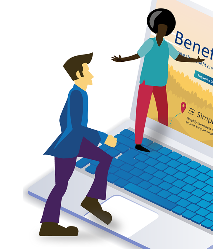
This one was a complete surprise to everyone and came straight out of my head! It is very heavy on the illustrations. The idea is that signing up for employee benefits and/or being the HR team who has to process the benefits is sometimes quite the arduous “journey,” so don’t do it alone- let us help!
The Solution
I presented the three mock-ups to the CEO and C-suite… They loved the third mock up and encouraged me to really go for it and make another version of the same idea… and so, I did!
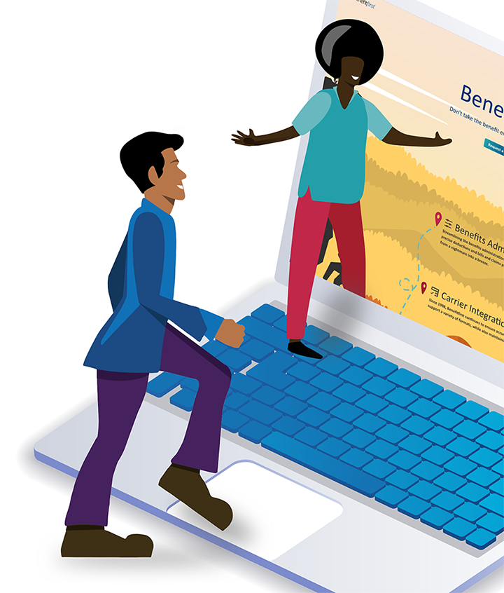
Below, I present to you the final solution. Please play the video to see a walk through. All illustrations you see have to do with some sort of journey/travel. I illustrated the characters that you see (as well as changed a few stock characters to make them our own). I created all of the UI/UX elements here from scratch as well as determining the user flow. Please enjoy!
Before and After
Homepage
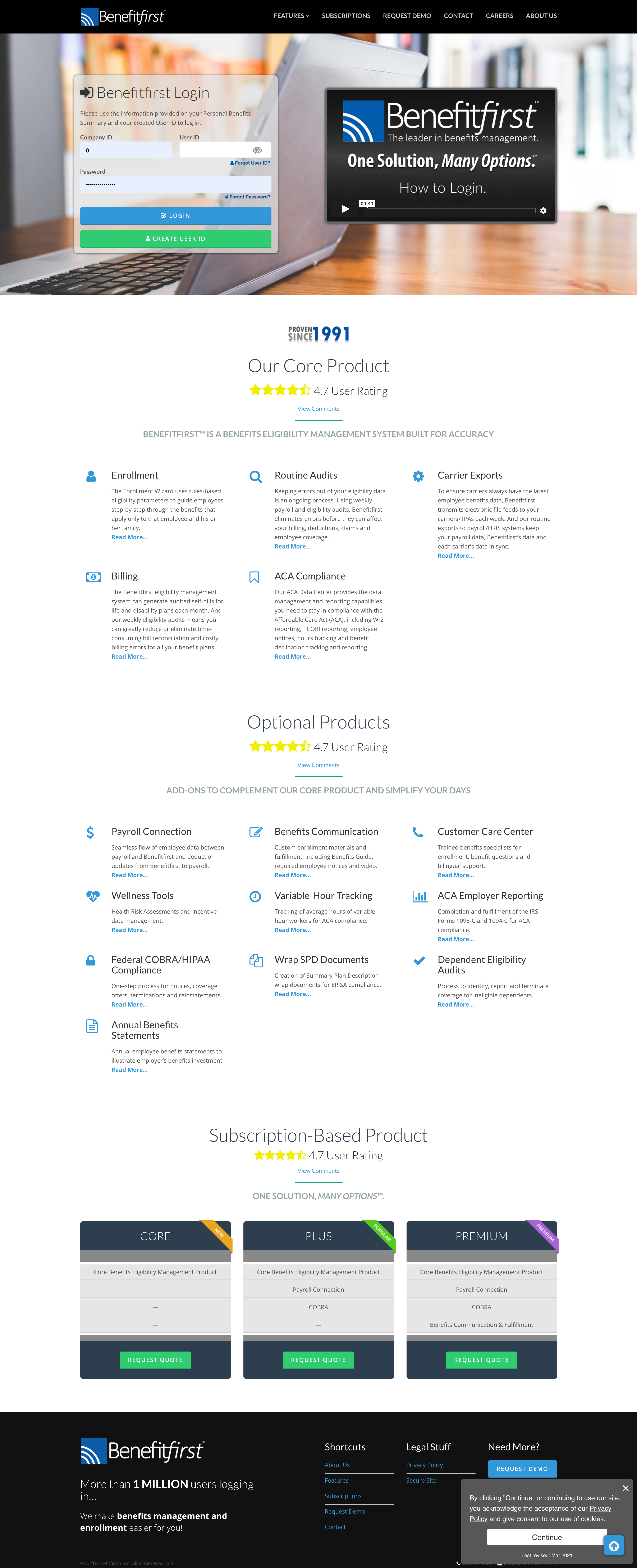
Subscriptions
Job Listings
Login
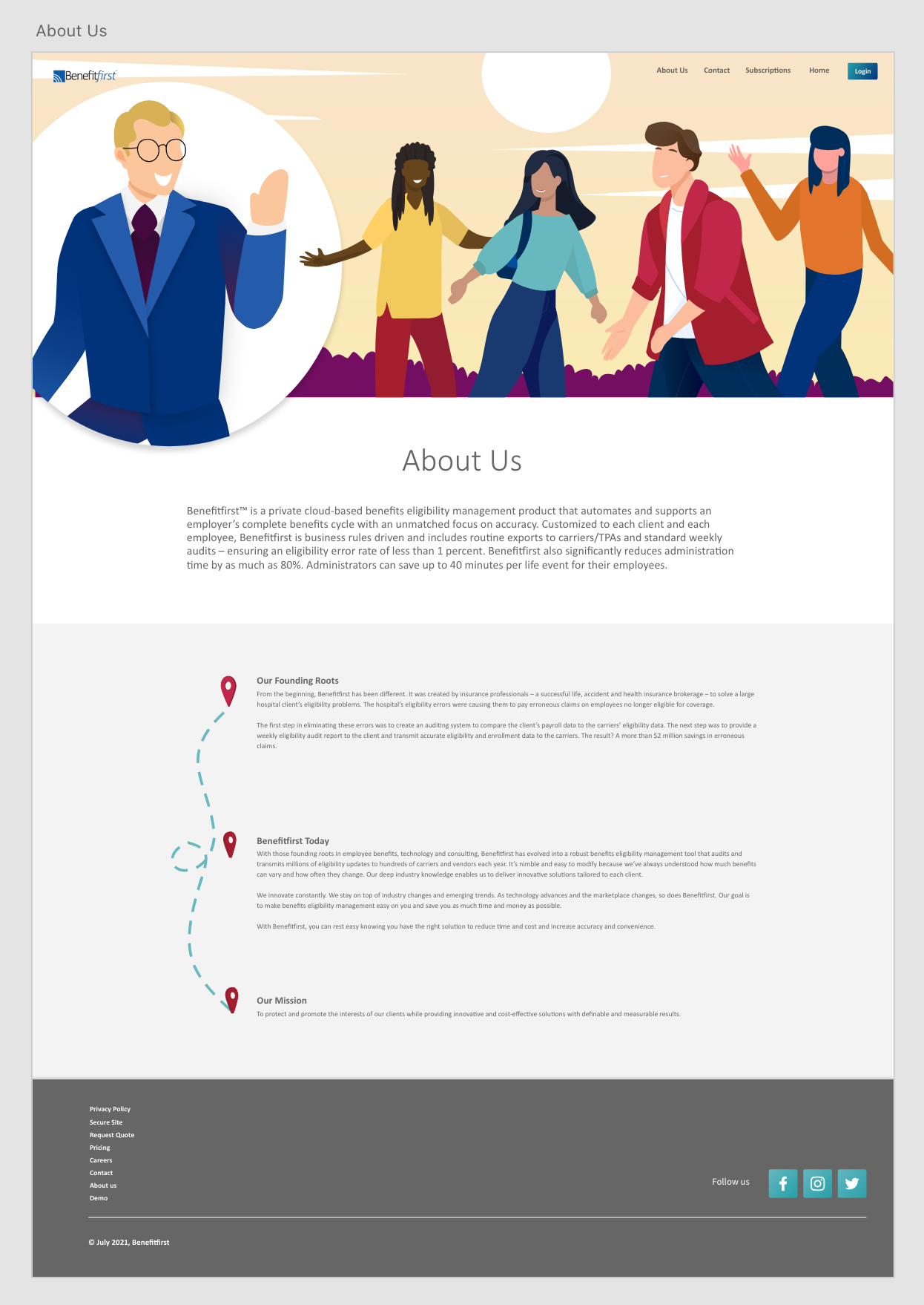
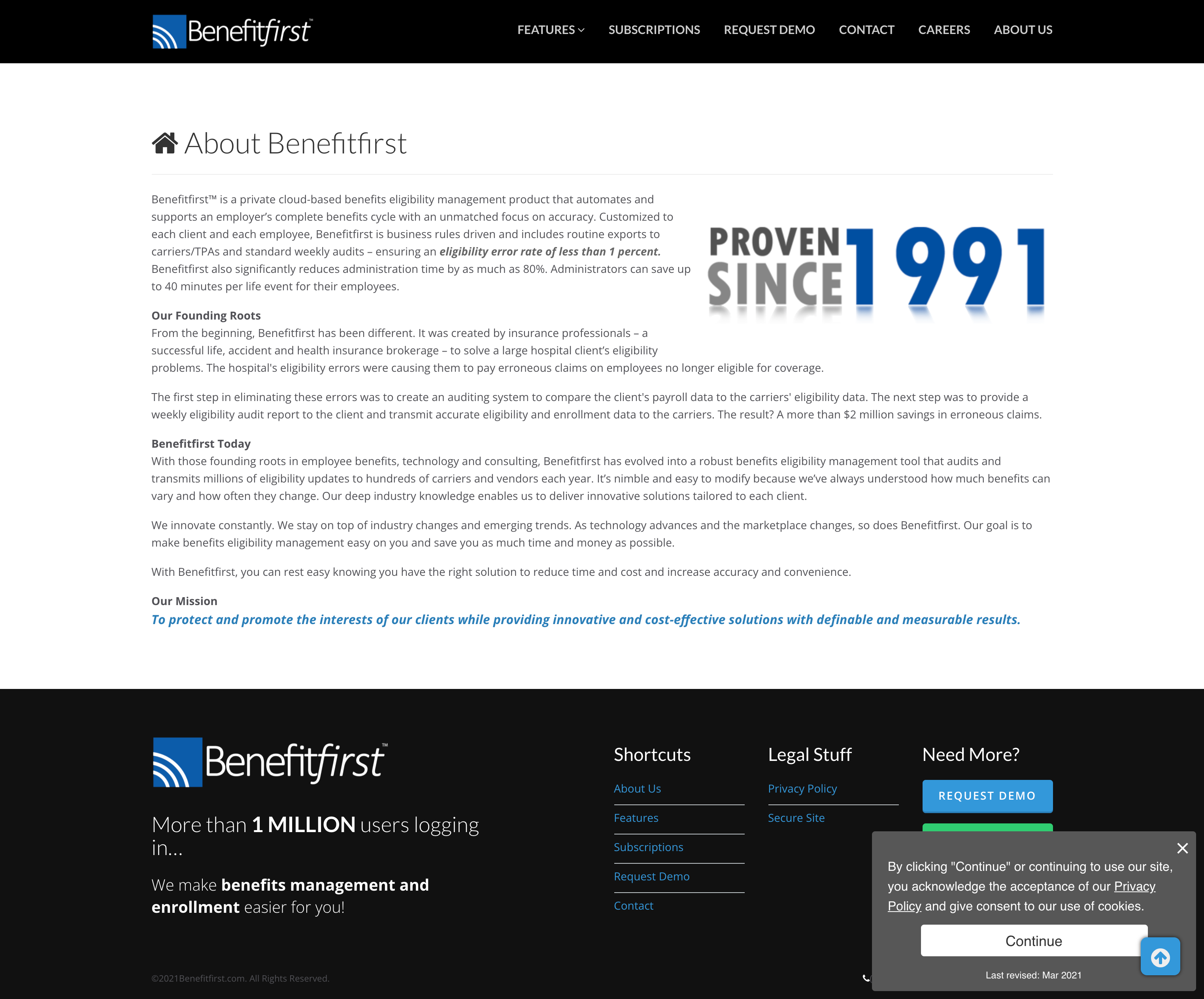
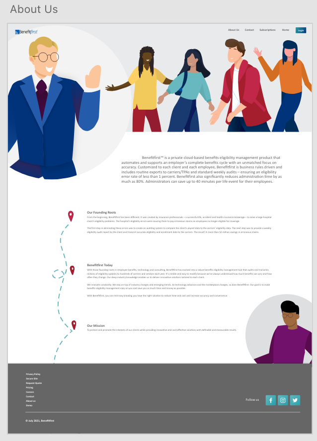
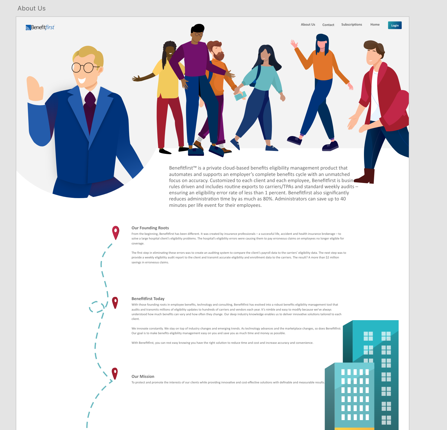
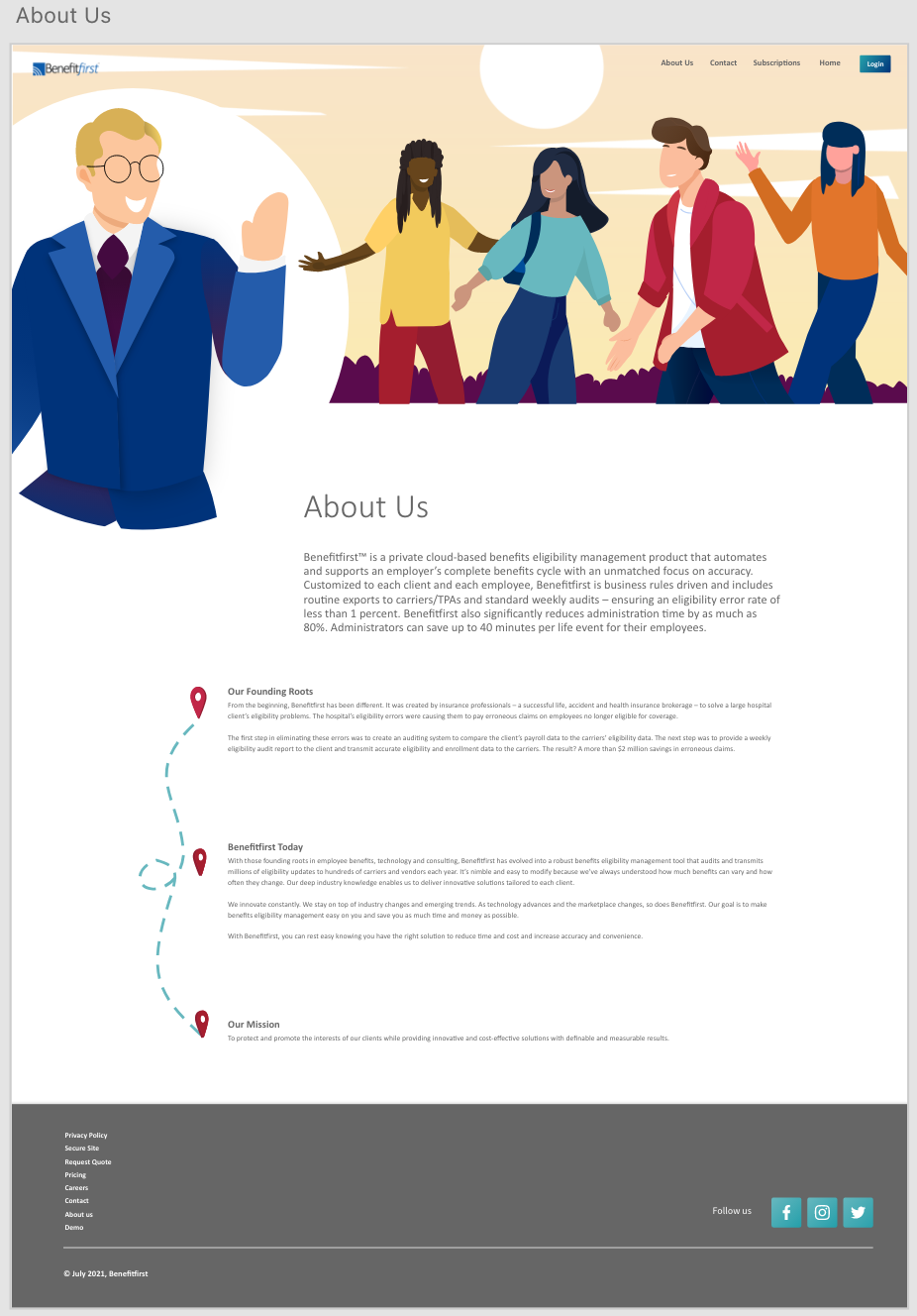
About Us
More Details
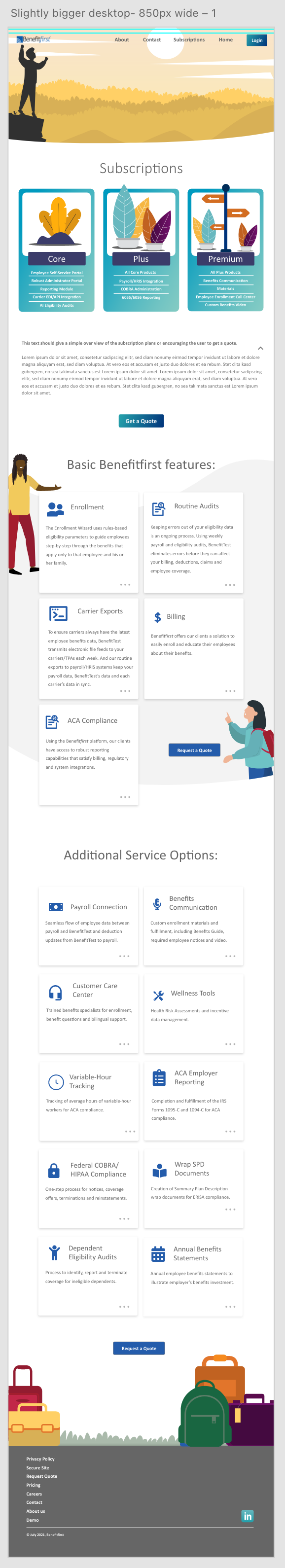
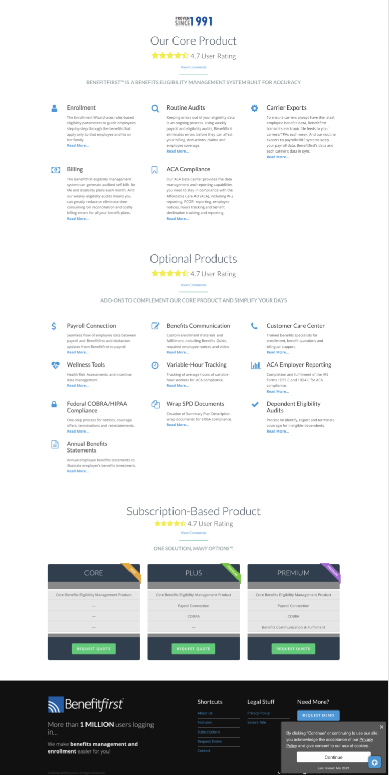
Responsive Design
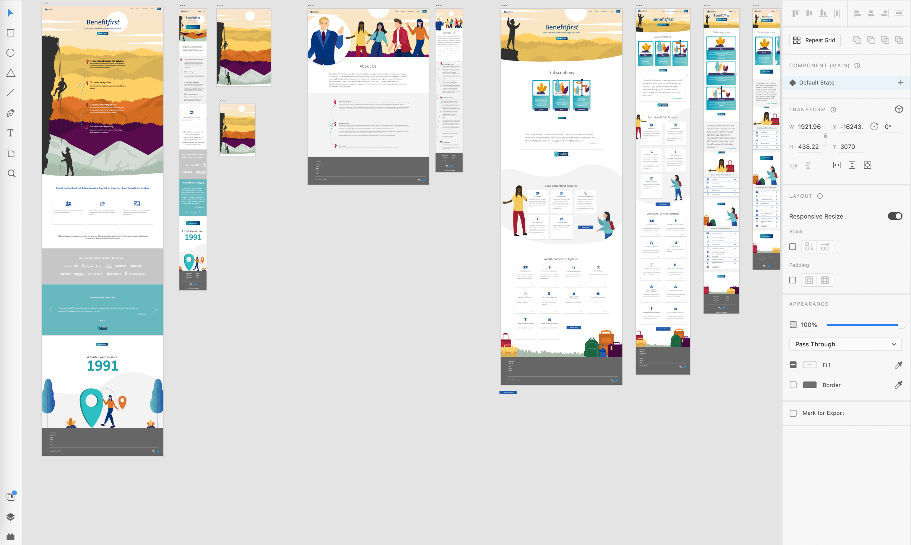
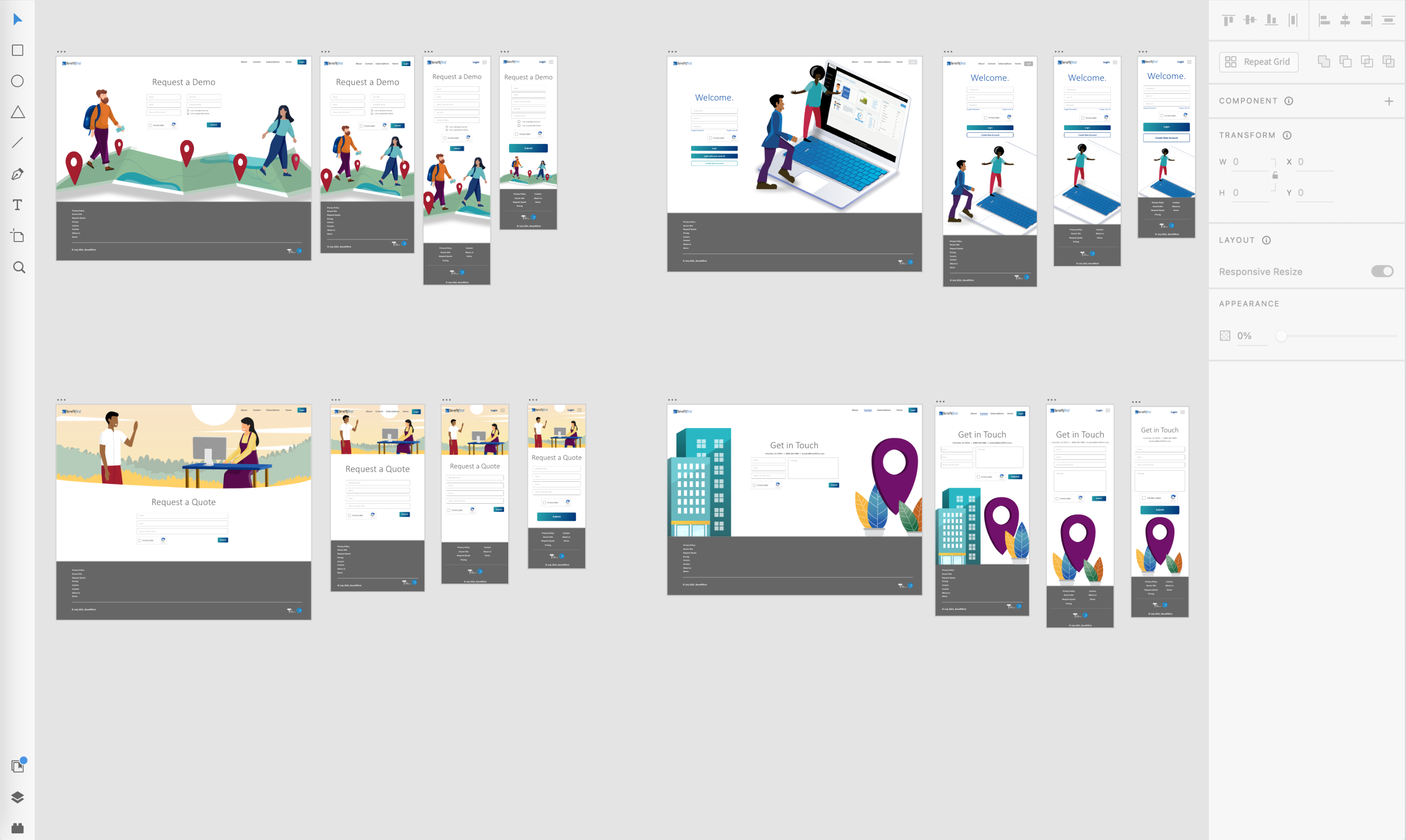
All websites must be mobile-first and responsive these days. Because of that, on most pages I designed four different sizes so that we could retain control over how the site looked, no matter the size. Below you see a desktop, smaller desktop, tablet and mobile phone version for almost all of the pages.
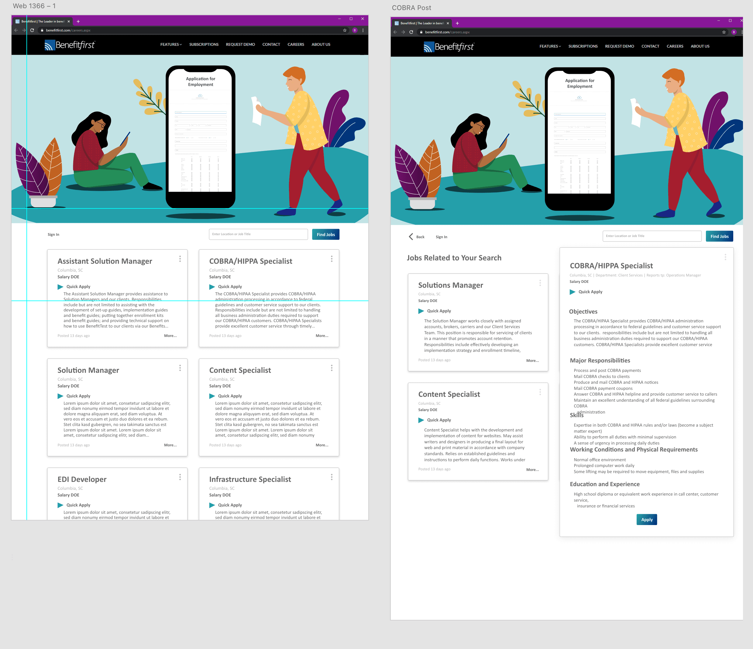
Job Listings
As an extension of the website, the “careers” pages were revamped. You can see they have the same animated style. The page to the left is a listing of all available jobs. Once you click on a job, you will see the page to the right which also pulls up similar jobs.
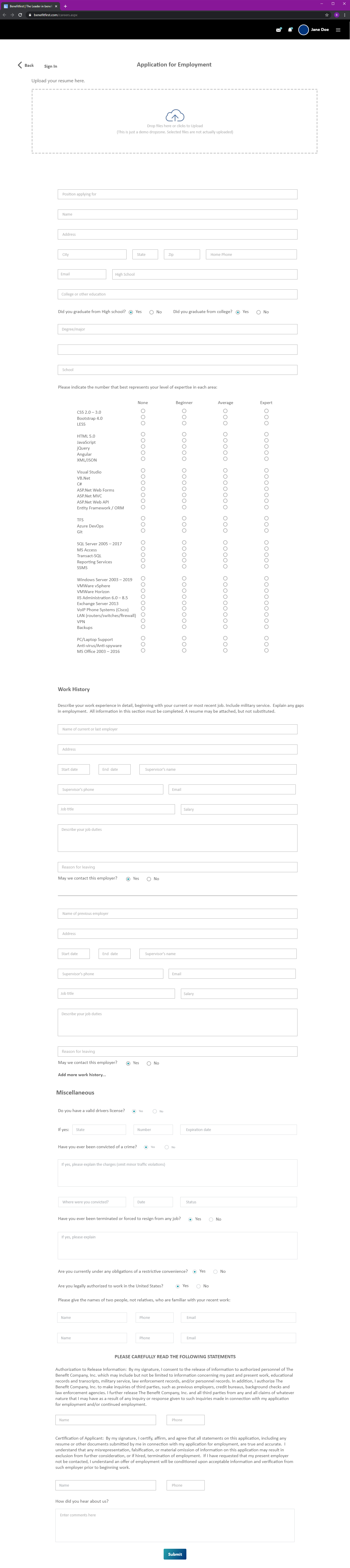
Below is a small part of a very long application page (make sure to click for the entire thing!). When an applicant clicked, “apply” on a job listing, it would bring them here. This page has a ton of minuscule details along with functionality such as radio buttons and an expanding “work history” section. Alignment, functionality and pixel perfect precision are key.

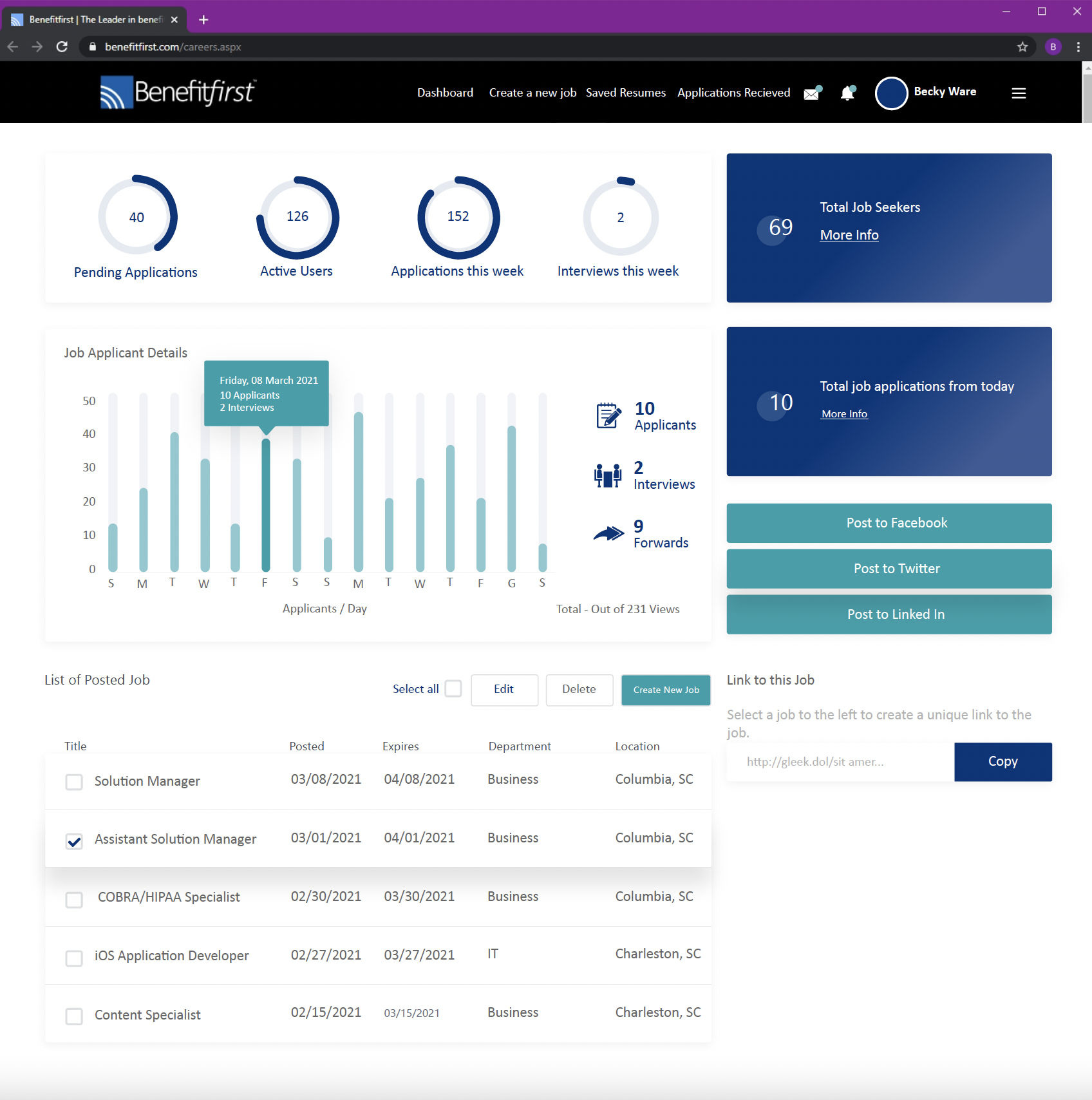
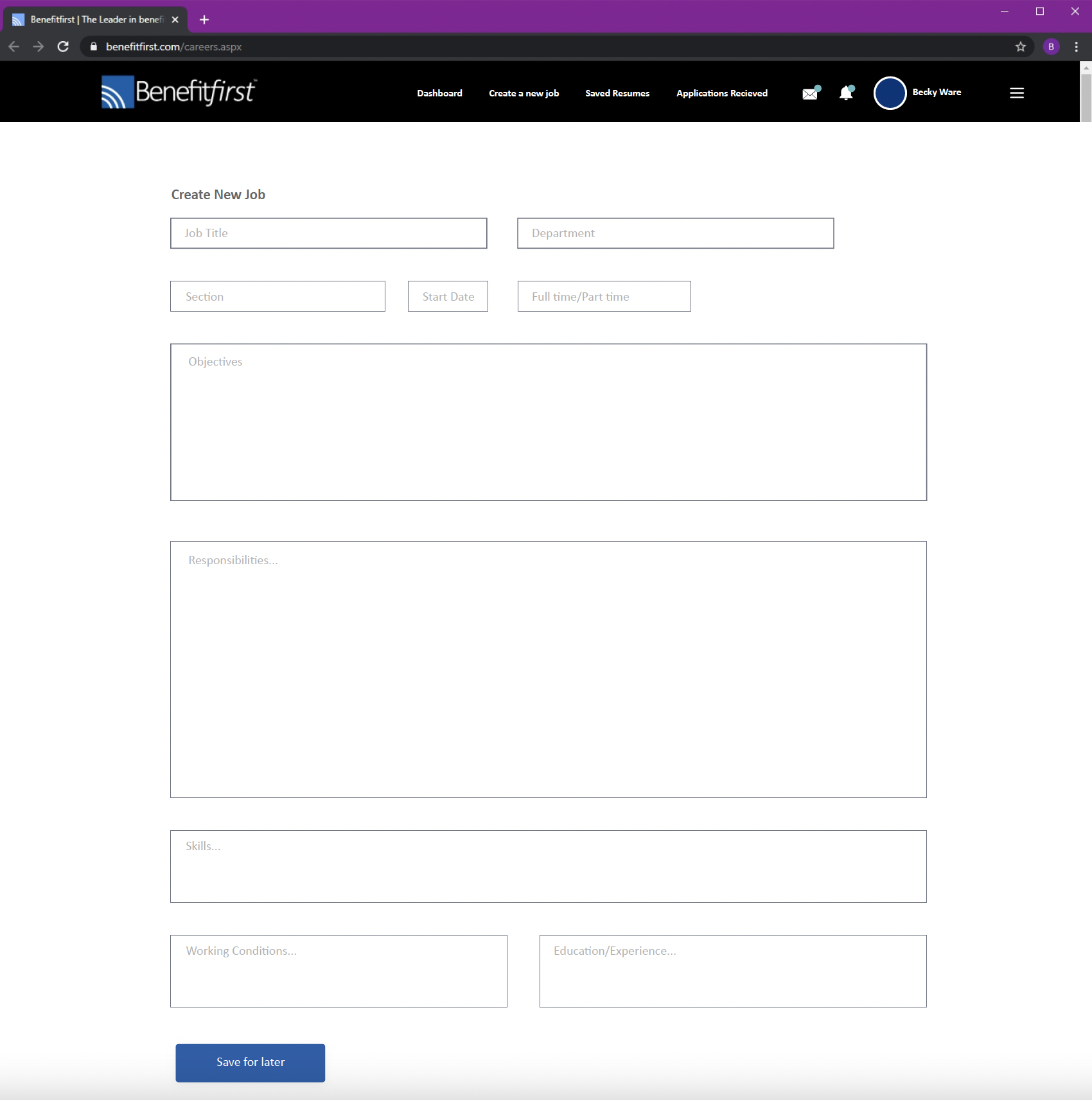
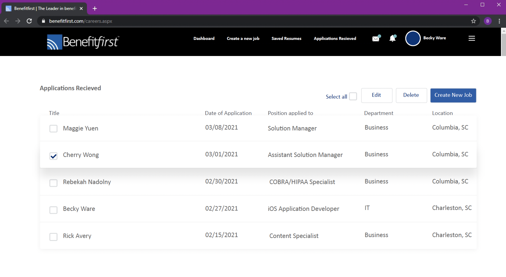
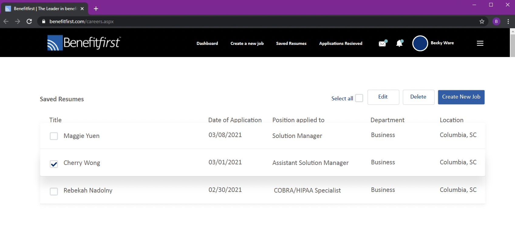
The careers pages also had an admin backend, not viewable to the public. They are below. Make sure to scroll to the right or to the left to see all the pages.
Wireframe
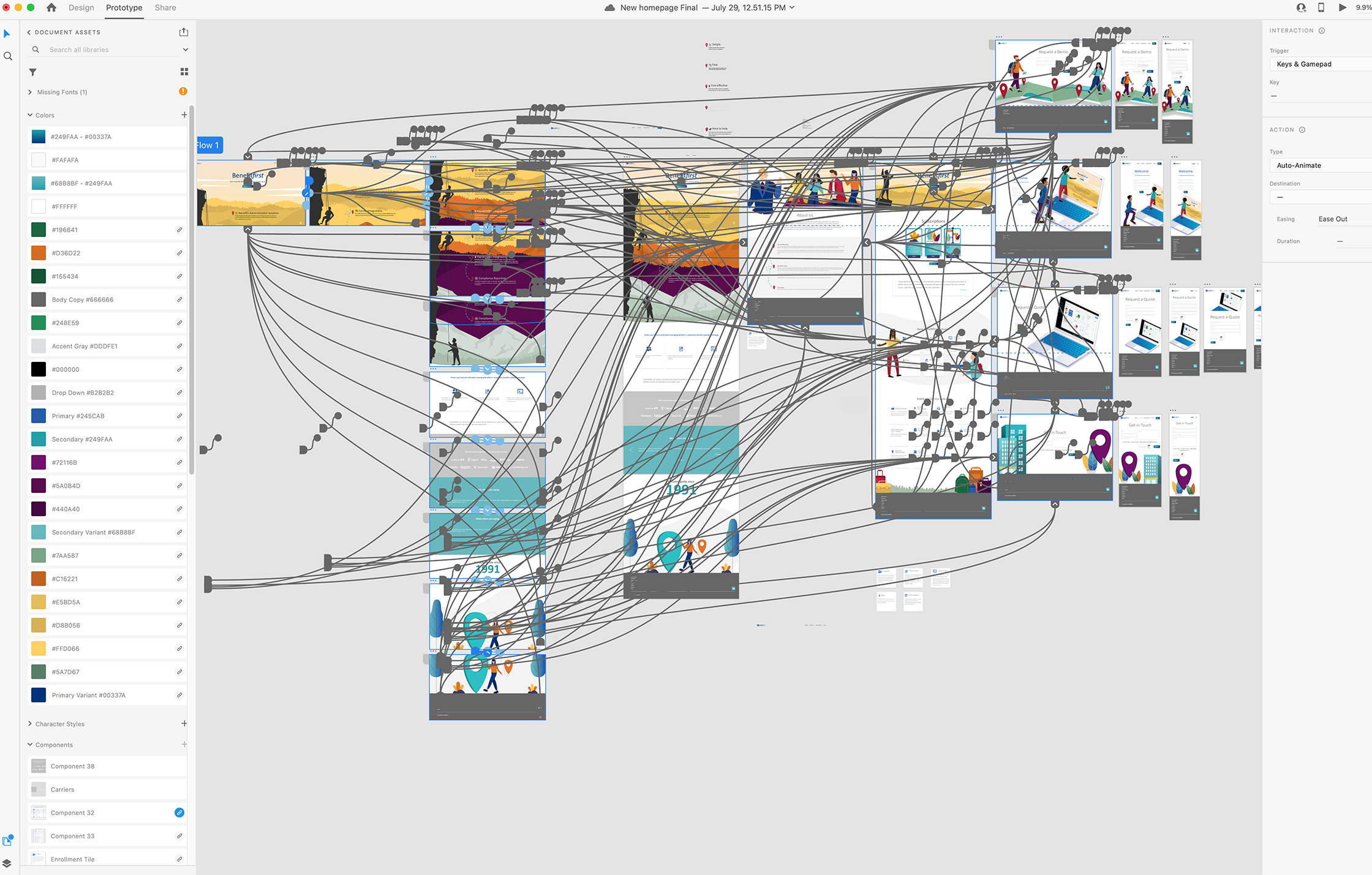
Here is a glance at all of the wire-framing involved in the process of creating the prototype.
I was able to work with some great developers at the company who are now building the site based on my designs. Typically, when working with developers, the hand-off can be a little sticky. I always make sure to ask them what their preferences are as far as receiving designs and other files to make it as simple as possible for everyone.
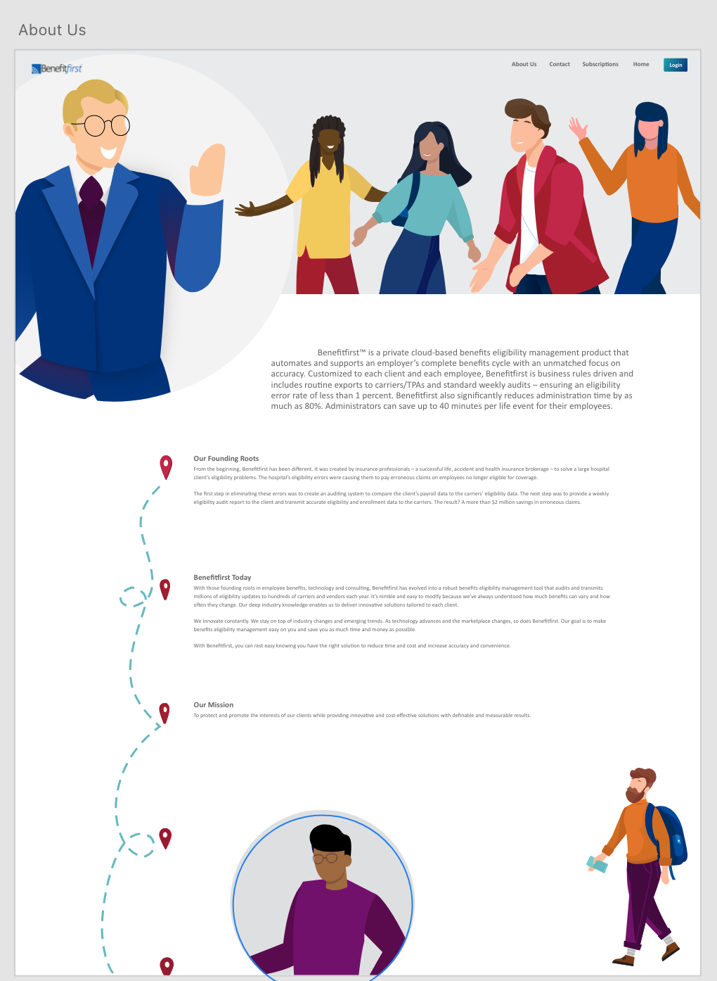
Below, you can see a progression of the “about us” page. Please click on the images to see them better.


Changes
No project is perfect. There are almost always changes, mistakes and tweaks. Below are some of mine. It’s important to be able to adapt on a dime and not take offense to any requests made!
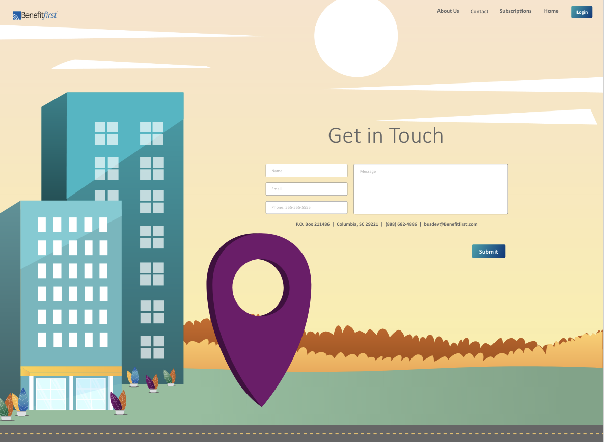
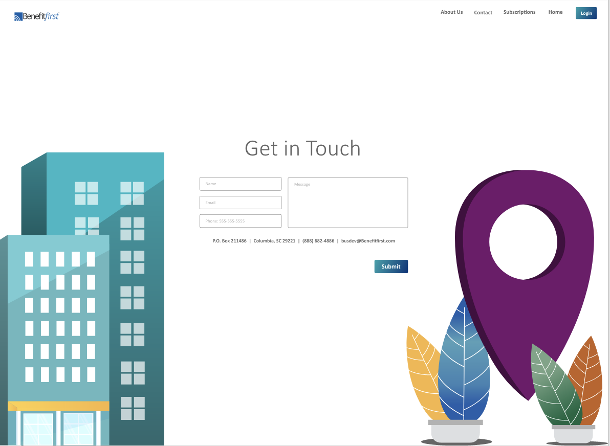
Below and to the left, you can see one of the original designs for the “contact us” page. Ultimately, it was decided that a more minimalistic, cleaner look was what we were going for. You can see the complete change in the image on the right. Slide the purple line back and forth to compare!
Below and to the left, you can see my original illustration of a man and woman. I ended up thinking the man was kind of pointy and I didn’t like that his skin was yellow. To add to the diversity of the pages, I made his skin a nice light brown, made him less “pointy,” and gave him a few features. The woman also got a smile! Slide the purple line left and right to see the difference.
Internal Pages
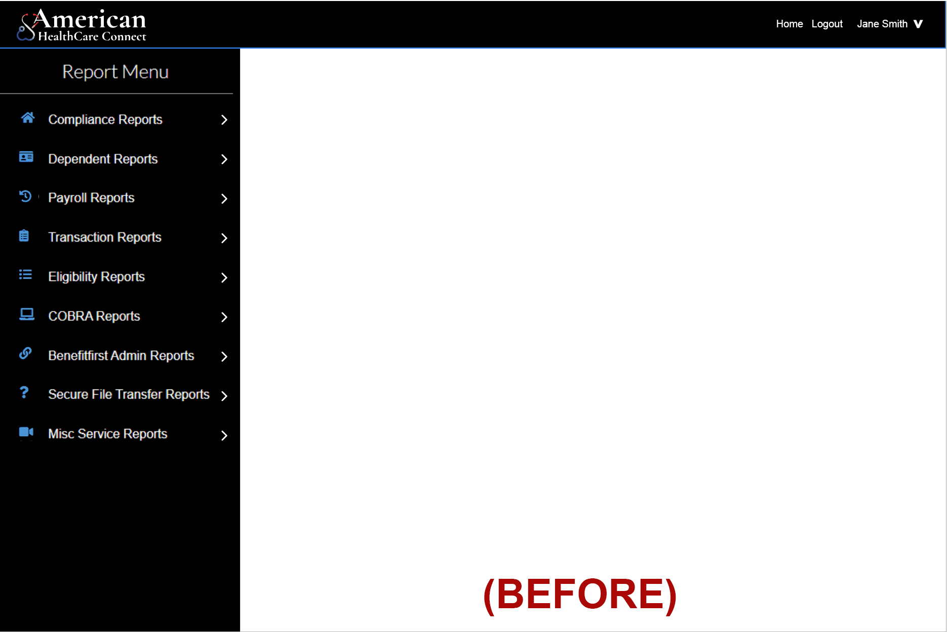
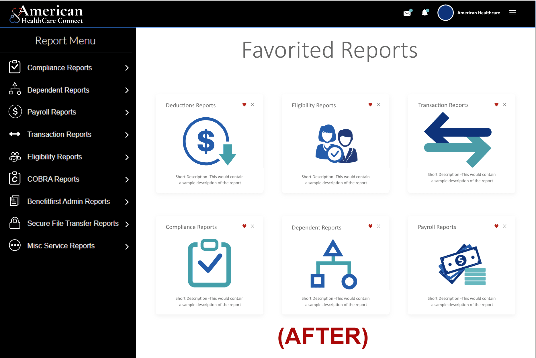
This is an ongoing project. The public facing pages are complete, so now it’s time to redesign the internal facing pages for our clients. This portion of the project is not complete, but here are some examples. Below and to the left, you will see how the “Reports” menu used to look. To the right, is how it looks now. I created the layout, and all icons both big (icons in the center) and small (left navigation). Please click for a closer look.


Benefit Statement
Here is a look at a client’s “Benefit Statement” (all information is made up and does not reveal this person’s actual information). As you can see, it was made with multiple sizes in mind. Hover over the purple circles for a short explanation.
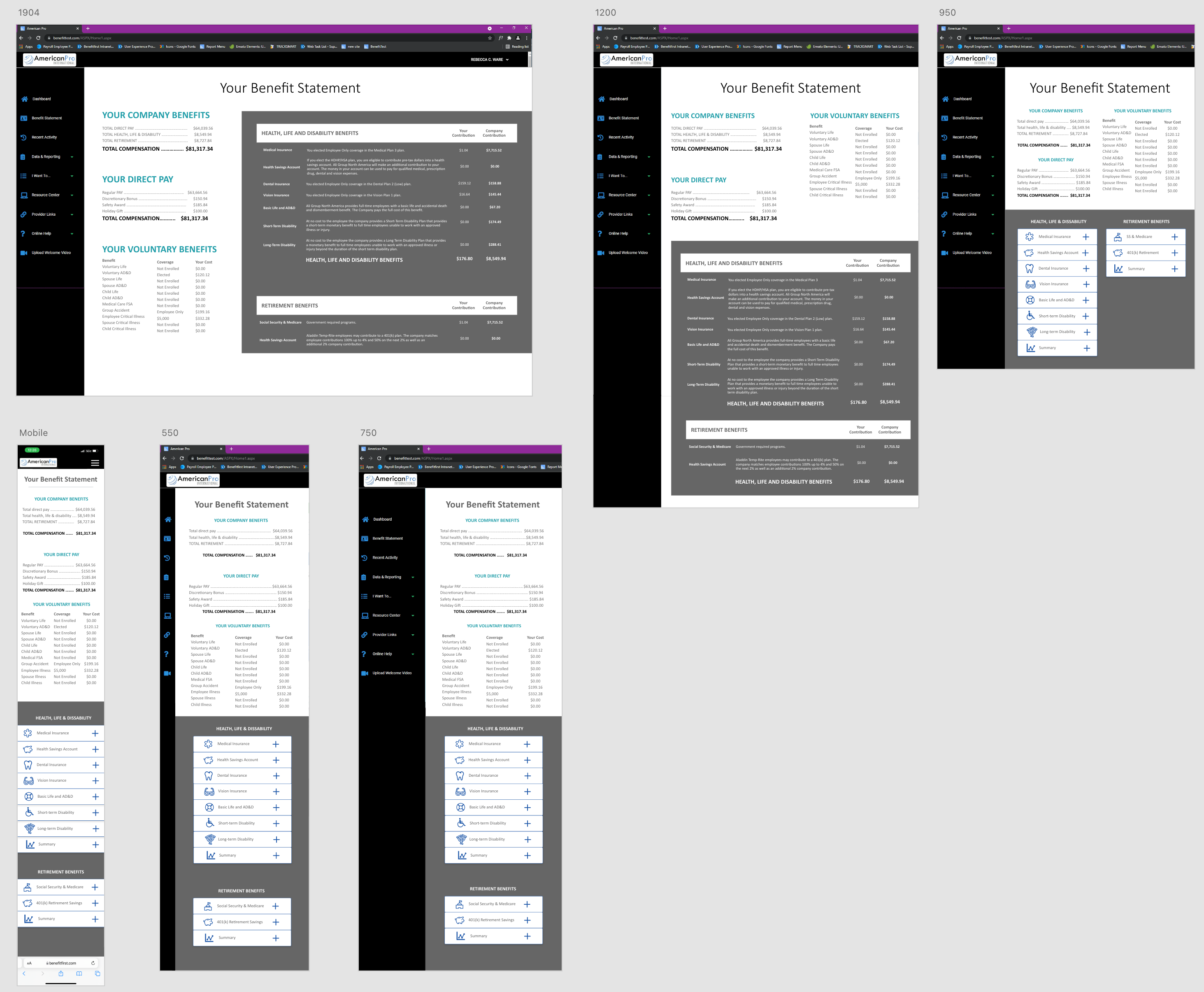
This is the regular desktop layout.
Here you can see a different, smaller desktop layout with the content rearranged to fit.
This design is tablet size and starts to use an accordion layout for the information that was previously in the gray chart.
For smaller tablets, the content begins to stack.
This design is for large phones and was a bit tricky with spacing. You can see here that the left navigation bar has been reduced to icons. When it is hovered over or clicked on, the menu slides out from the left.
Here is a regular mobile phone layout.
Overall, I had such a good time making the site and as it stands, there has not been a single negative comment! There’s a first time for everything, y’all!