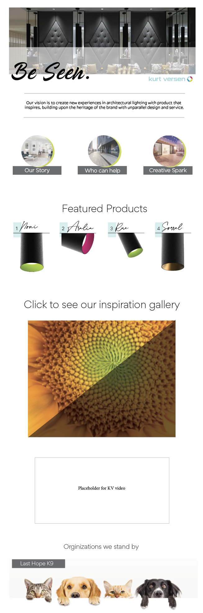
Kurt Versen (KV) is a lighting product brand. I was in charge of giving it a facelift. The website was one of the main focuses. Below you can see all of the mock ups I presented. The brand’s persona is also shown beneath as well as the “Look Book” that I designed it to give an idea of what the project called for. Hover over the purple dots to see highlighted features and different calls to action.
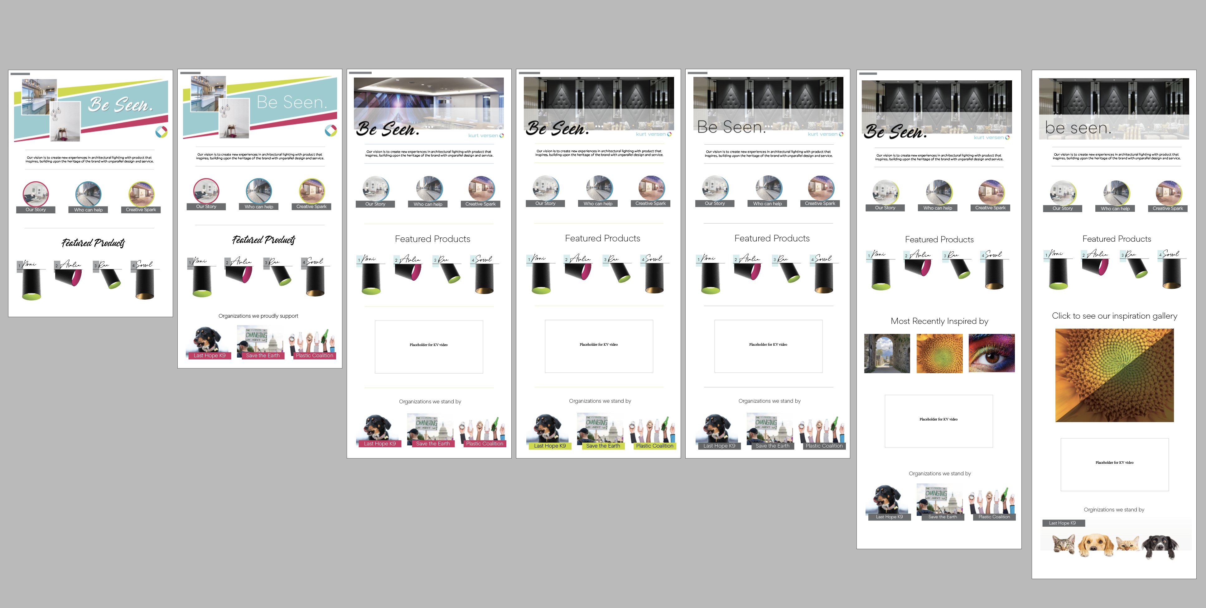
Bright and light header, meant to scroll through various images.
Quick links to the other pages on the site; Our story, Who can help, and Creative Spark. All outlined with various bright and light colors to add visual pop.
Here you see a place for KV’s featured products. The typeface used here is a part of the logo used by the product family which is featured.
KV’s logo symbol
Added here is a section that highlight’s the brand’s key values which is financially supporting organizations dedicated to the environment and animals.
One of the proposed alternate banners to rotate through the header.
A different treatment is proposed here with only one blue color and the color being offset instead of outlining the circle image.
Here, the number blocks have changed. This version tries out a light blue color.
I suggested a brand video needed to be made and placed on the homepage. It hadn’t been made yet, though.
One of the proposed alternate banners to rotate through the header.
Typeface changes have been made throughout – all brand typefaces.
The full KV logo has been swapped for just the symbol.
Color treatment here has changed from pink to green – all KV brand colors.
Line color treatments change throughout to provide many options.
Color treatment alternative.
This is an “instagram-like” grid from the “Creative spark” – a page on the website which shows what inspires KV.
An alternative display for the “Creative spark.”
Instead of listing all organizations that the brand supports, and potentially being viewed as “too political,” an alternative is suggested to just show the animals the brand supports.
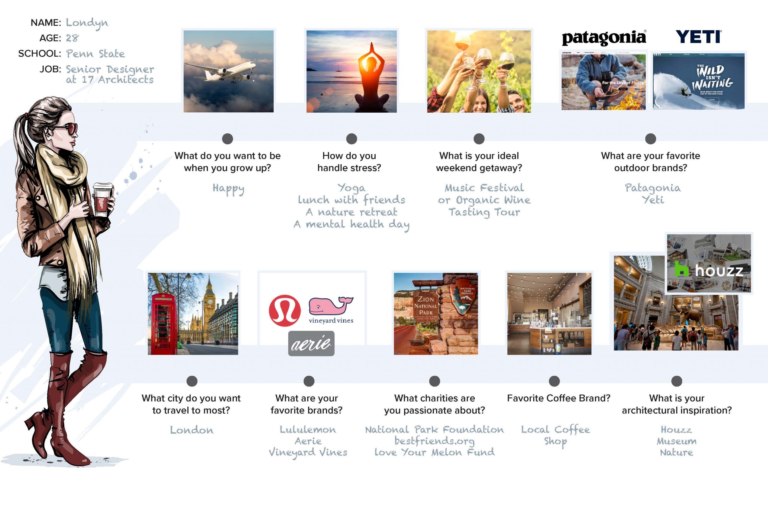
KV’s Persona Board
Final Design
Ultimately, the brand chose this mock-up and were quite pleased!