Company persona
Color pallette
Fonts
Company brochure
Product brochures & launches
Print Advertisements
Digital Advertisements
Marketing Strategy
Tradeshow ideation and design
Color pallette
Fonts
Company brochure
Product brochures & launches
Print Advertisements
Digital Advertisements
Marketing Strategy
Tradeshow ideation and design
Client
Hubbell Lighting Components
Year
2018
The Challenge
I was hired at Hubbell Lighting to help re-vive one of their brands that had fallen on hard times. The brand’s reputation in the industry had been tarnished and they needed to give it new life. What had started as two partnering brands (TRP + Norlux), were to be merged into one: Hubbell Lighting Components (HLC).
The Persona
After much research about the industry, the brand’s products, competitors and the brand’s demographic, a persona was developed. It’s majority was a 25–35 year old male engineers, looking for something new, relevant and something with meaning. Research was also done into the lighting components industry about colors used. HLC wanted to be different, but not so different that it pushed people away. The main colors in the lighting components industry were shades of blue and green. I went directly in-between the two and chose a teal color; a mix of green and blue.
Colors
Midnight
#0f0e0c
Moon
#9b9d9e
Snow
#ffffff
Ivy
#1f9d7f
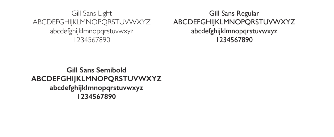
Fonts
The Brand Book
Below is the brandbook that I created, did all the research for and presented to the board. In it, you will find a few options presented as potential mock-ups for various projects like websites and proposed campaigns. The board loved all of it and I received high accolades.
The Collateral
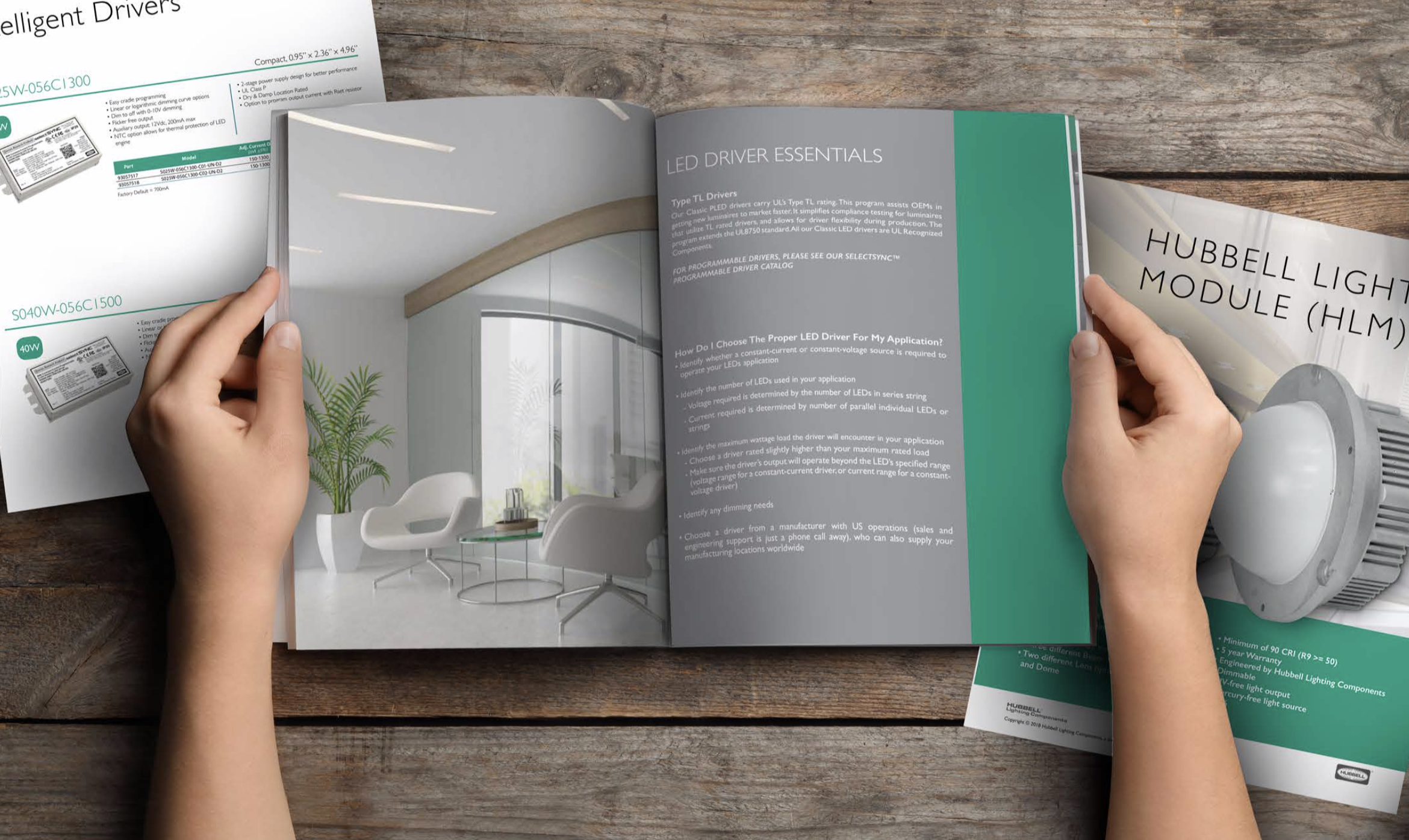
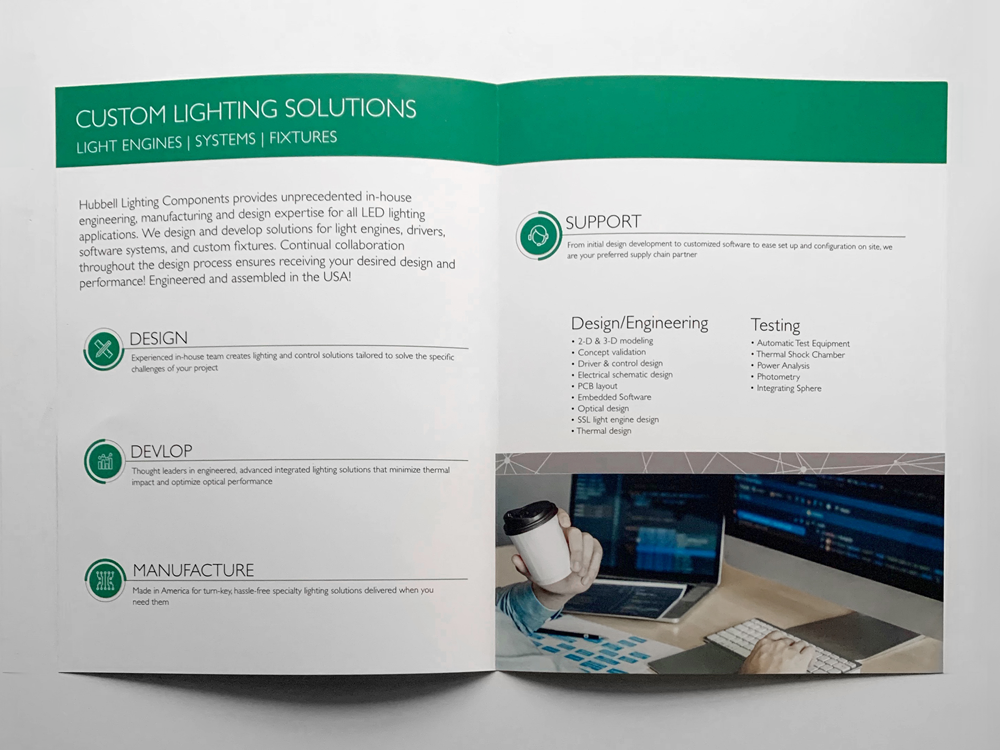
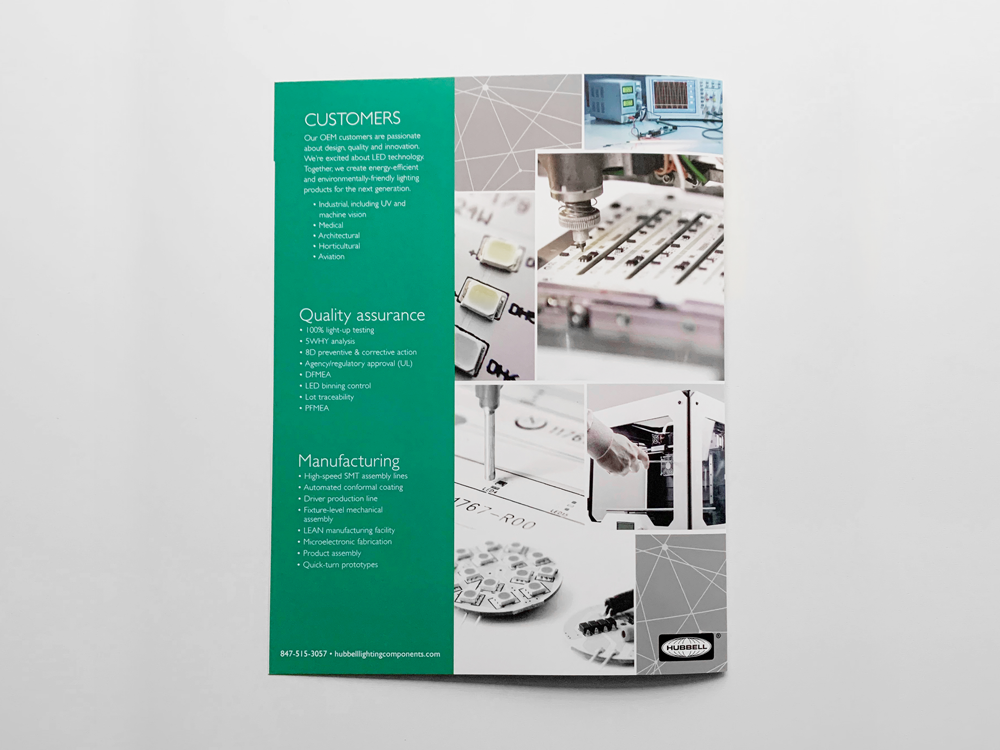
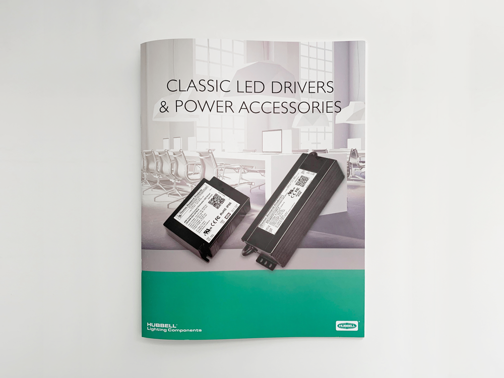
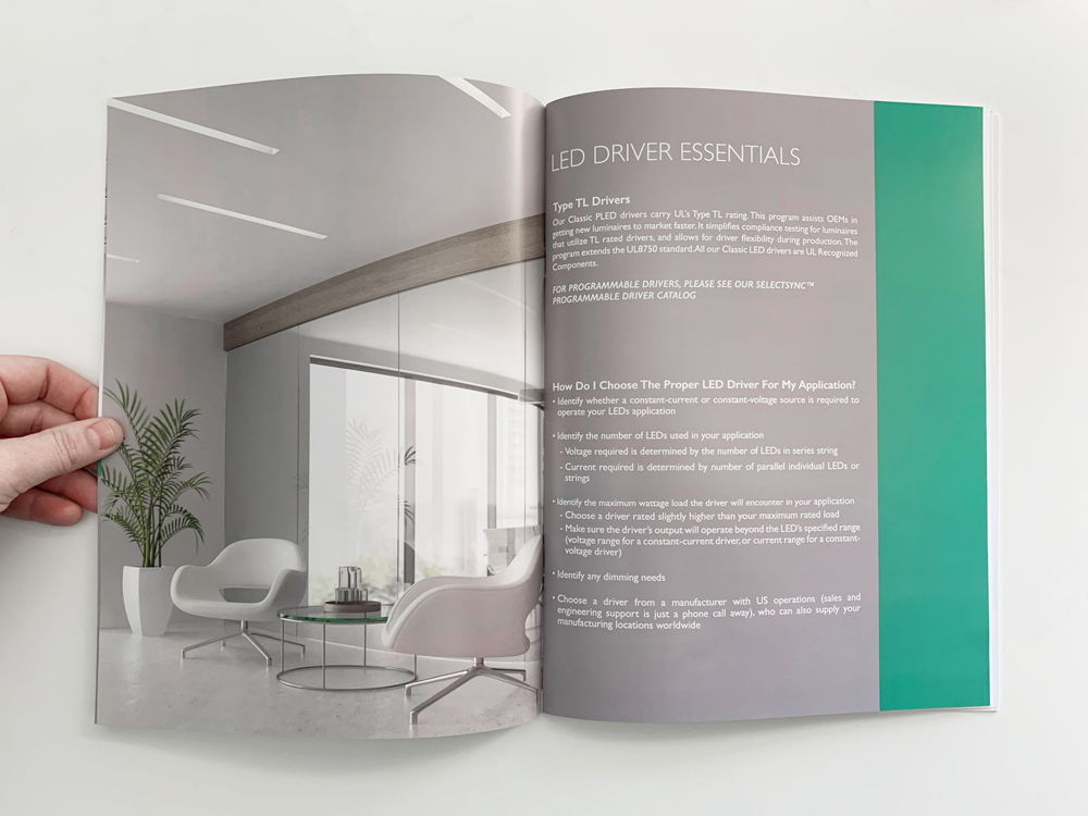
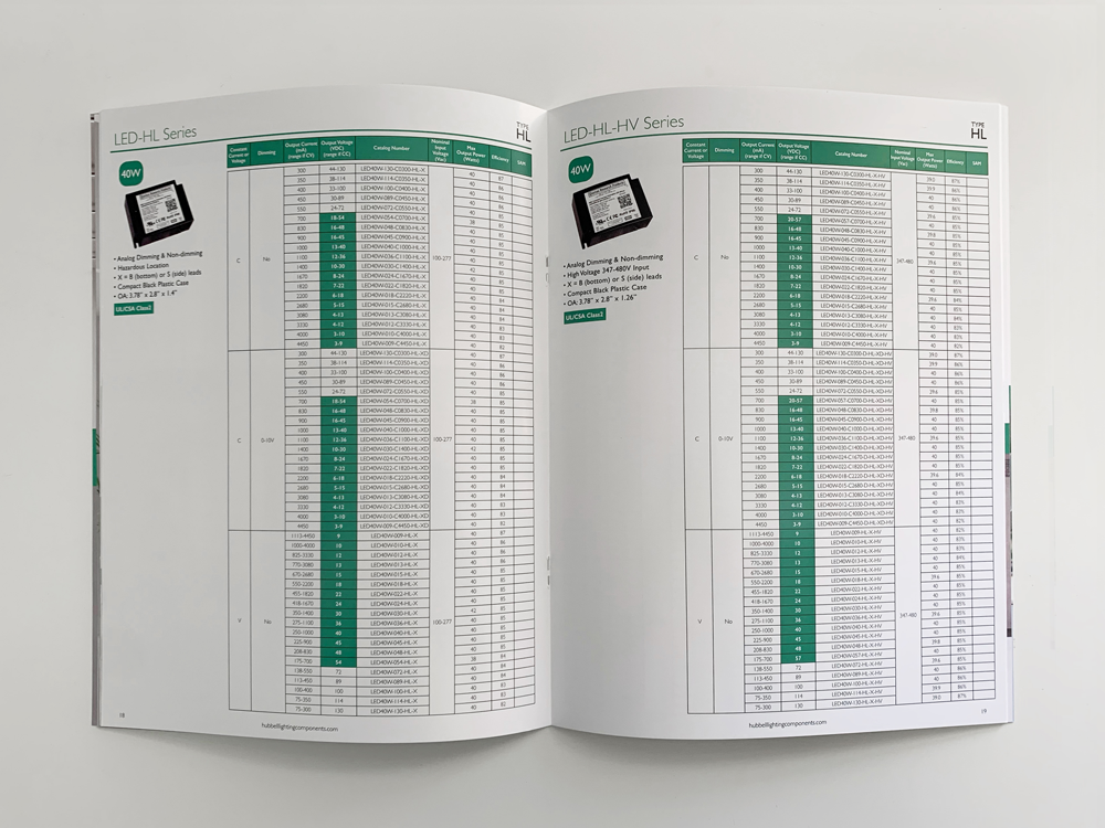
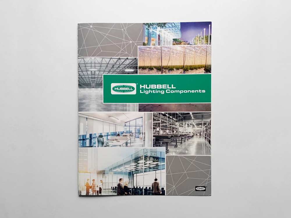
All of the brand’s collateral, website, tradeshow materials, emails and videos needed to be re-branded. I started with what would be the HLC brochure. The text content was created by myself and my teammates. I executed all graphics and layouts.


The Website
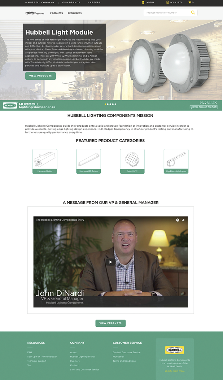
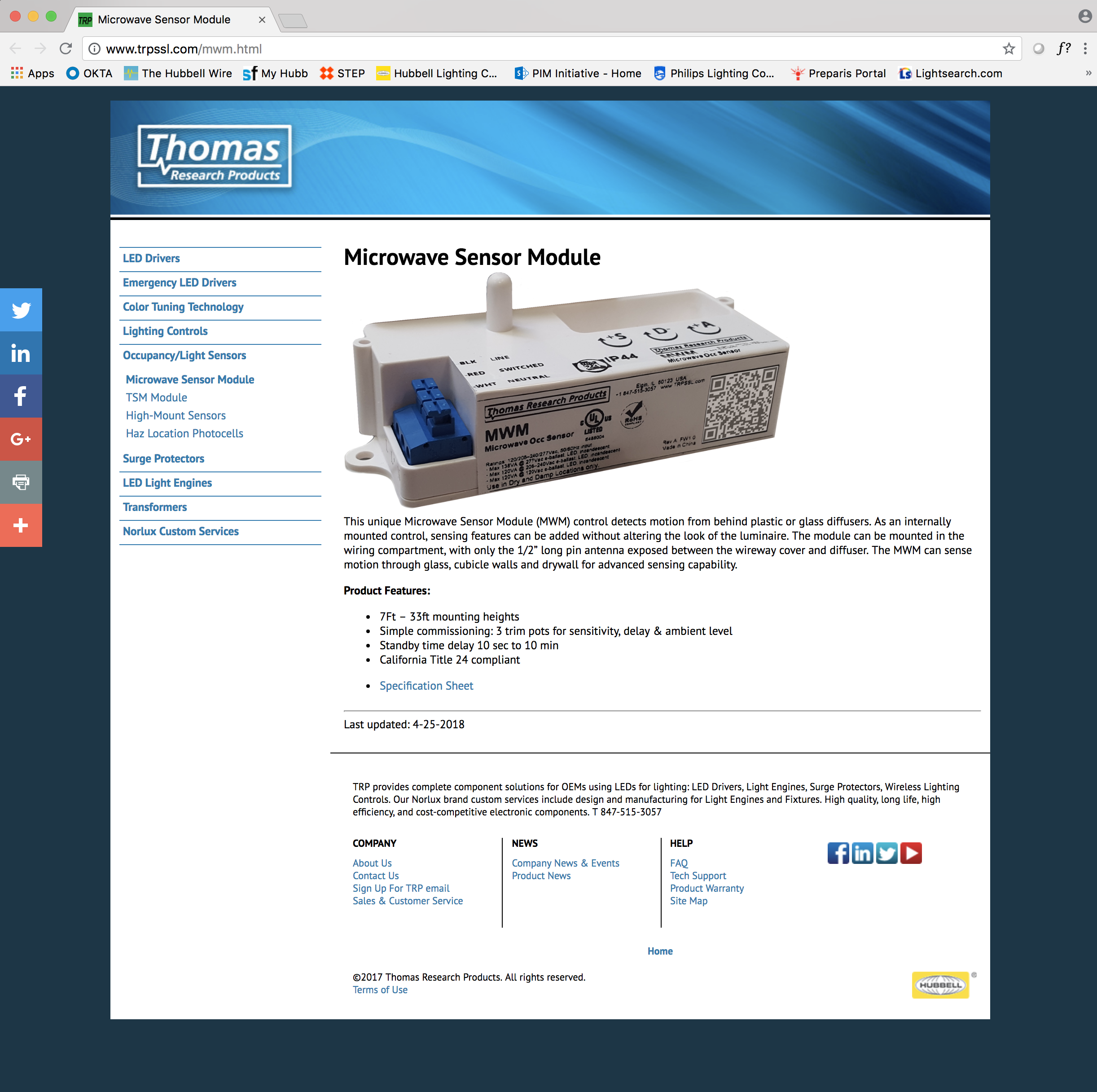
Below you will see a comparison. The original website is on the right with all of the blue. My redesign is on the left.
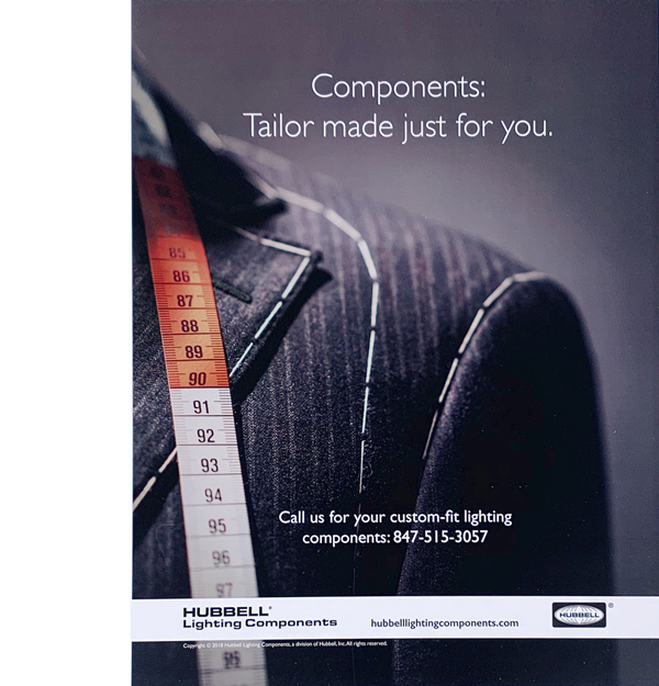
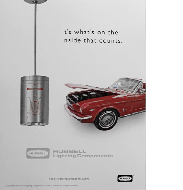
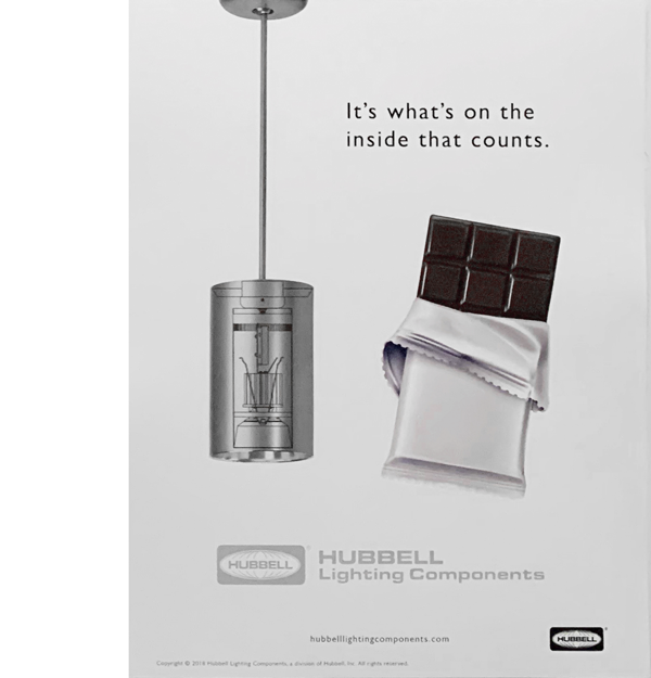
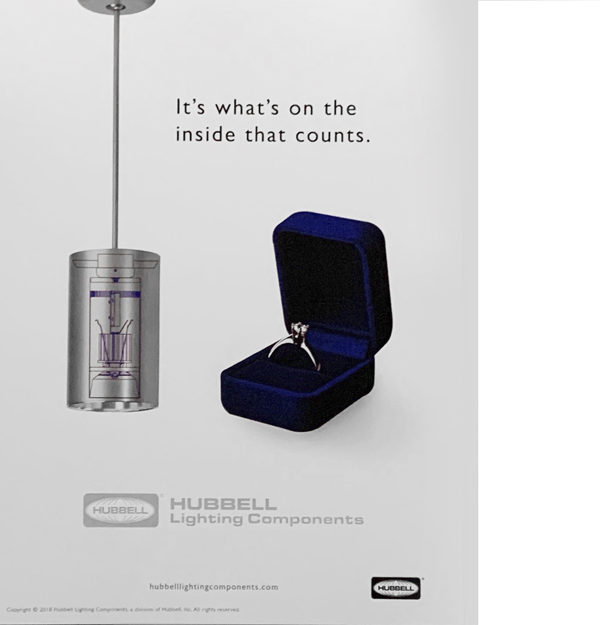
The Ads
HLC had a full page ad in LEDs magazine, both print and digital. We decided to do an A/B test and make two completely different ads; three were used online in various locations in partnership with LEDs magazine, and the other was printed in the physical and digital magazine. Both were a huge success and it was reported to be,
“Refreshing to see something clean and current in a lighting components magazine that is normally dated and filled with wires.“
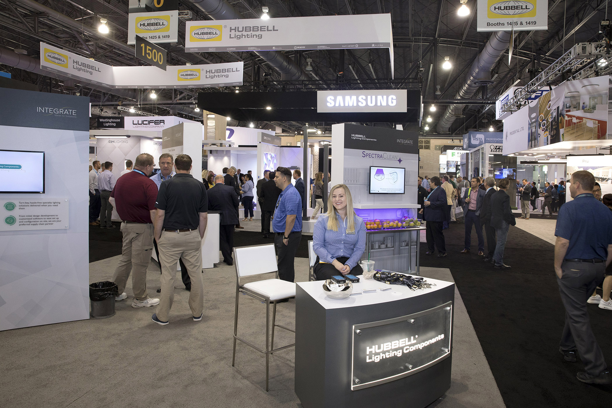
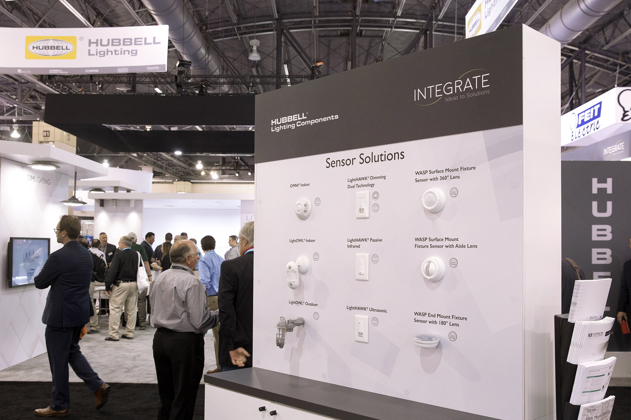
The Tradeshows
Here you can see HLC at the biggest tradeshow of the year. HLC’s parent company, Hubbell Lighting, was also there – the HLC displays needed to match what Hubbell Lighting presented which is why the colors are a little bit different than usual.
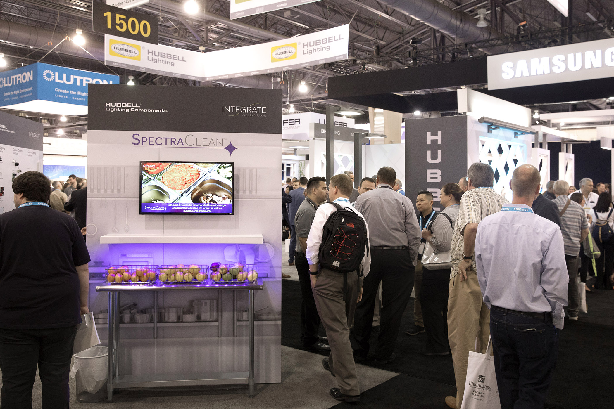
In the first image, I created all of the graphics seen on the wall to the left. The product was a light that could shine on any surface and the light sanitizes the surface. A practical application would be in a restaurant’s kitchen. I thought up the idea to place a life-sized image of a kitchen on the wall and have a table cut in half and protruding from the wall as if the kitchen was coming to life. On the table is some fruit that the light would sanitize. The product’s video was displayed on the monitor above (for which I managed and created the story board). In the images below, I was able to create and prepare all of the graphics seen on the closest walls and the gray desk.
Roles and responsibilities:
Rebranding, campaign ideas, art direction and campaign strategy:
Becky Ware
Copy in brochures:
Leslie Baker (manager), and David Early (Product manager)